As a development economist it is easy to show that “in situ” interventions that have very large returns in raising the income or wellbeing of people in a given place are relatively rare (e.g. the “gold standard” RCT evaluation of the “graduation” approach to poverty across five countries make claims it is an effective program worth funding based on an ROI of around 7 percent). and have modest impacts. It is also easy to show that since the productivity of people with the exact same characteristics varies by factor multiples (the “place premium“) the income gains from labor mobility from poorer countries to richer countries are massive (here), orders of magnitude larger than most anti-poverty programs (here ). And, not surprisingly given the wage differentials, according to Gallup surveys around the world there are around a billion people willing to move if they were allowed to (or, if asked about permanent movement, about 750 million).
But, all that said, and roughly undisputed, there is little or no attention to international labor mobility (except as refugees from crisis or conflict, as we see recently with the war on Ukraine). I think that is because most people see tight restrictions on labor mobility in rich industrial countries as a “condition” not a “problem” and just take it for granted that since greater labor mobility is politically impossible it is not worth talking about.
My new paper “The political acceptability of time-limited labor mobility: Five Bricks through the Overton window” (which was presented at a recent symposium at NYU and has been submitted to Public Affairs Quarterly) does not dispute that substantially greater labor mobility into rich countries has been politically impossible (while “immigration” has been going up in most OECD countries but it has been going up slowly, from a low base, and as much from within rich country mobility as allowing people from poorer countries), but argues that when the facts change, people can and do change their minds, and that the facts about rich countries are changing in ways that will put greater labor mobility, of multiple modalities, including more widespread time-limited mobility to meet specific labor market needs, squarely into the Overton window.
A principal driving cause of the shift in political acceptability is the combination of demographic shifts, where an ageing population implies many, many more people who need to be supported and many few labor force aged people to do the work and pay the taxes. And, shifts in the labor market are creating many jobs that require core skills (but not high levels of formal schooling) such that these jobs just cannot be filled as there aren’t enough native born youth who want these jobs (nor, in an economically efficient world, should they).
That much greater labor mobility from poorer to richer countries will become politically feasible in the near to medium run horizon (within a decade) because it will be in the best interest of voters in rich countries to allow it (again, in various controlled modalities, not “open borders”) is another view of mine that is in a decided minority, but right. You’ll see.
This is the paper revised as part of the submission process to Public Affairs Quarterly on May 20, 2022.
[I wrote this blog back in May 2021 but then put it into a waiting period to make sure I wasn’t saying something rash and intemperate (which I have been known to do and which is why I am not on Twitter, ever. I finally (five months later) have decided to post it (with minor revisions) since the point continues to be topical.]
A May 10, 2021 blog post (article in Project Syndicate) from JPAL titled “Growth is not enough” has these striking lines:
But for millions of people living in poverty, growth is not enough. Specific, targeted social programs based on rigorous empirical evidence are equally important to prevent people from being left behind.
This claim of “equally important” is striking in four ways.
First, even without any knowledge on the topic, to anyone that takes empirical claims seriously this is strikingly implausible. “Equally important” is a set of measure zero. That is, if I told you that electron mass and proton mass were equal your first thought would be: “Really? Of all the masses that particles could have they just happen to be equal? There must be some really deep and important feature of the universe that makes that fact be so as, without that justification, it is just a strikingly implausible coincidence.” (And you would be right, the proton to electron rest mass ratio is 1836.15267343 (truncated at some digits) which is an appropriately arbitrary number). So even without knowing any empirical facts one already suspects this is not a factual claim at all, but emotive rhetoric.
Second, anyone with any knowledge about global poverty knows that, as a general claim, it is false, not by a little but by a lot (at least factor of 10, maybe a factor of 100) and known to be false. I have research (summarized here) that shows that growth is, in fact, enough: that a higher level of median consumption is in fact empirically sufficient for reducing a country’s absolute headcount poverty. If by “growth” one means differences across countries in the level of median income/consumption (which are necessarily the result of differences in long-run growth) then growth alone (with a flexible functional form) accounts for around 98 percent of differences in absolute headcount poverty.
David McKenzie (who has himself done some great RCTs) has a 2020 commentary titled “If it needs a power calculation does it matter for poverty reduction?” that starts from the premise that everyone accepts that the typical (median) productivity in the place (country/region) where a person works is far and away the most important determinant of their income and hence likelihood of being in poverty. Therefore growth and migration are obviously massively important for poverty, the only question is does anything else “matter” at all and by how much? (with zero possibility it is “equally important”). The point is that this is not a dispute between my research and their research. That growth and programs are not, in general, “equally important” is just common knowledge.
Third, this claim is specific in a way that makes it both even more obviously false and also obviously self-interested. The claim isn’t just that “social programs” are equally important. The claim is that the subset of social programs that are (i) “specific” and (ii) “targeted” and (iii) “based on rigorous empirical evidence” are “equally important.” The claim “public transit accounts for an equal share of commuting to work in the USA” would be implausible (again, why “equal”?) and empirically false but the JPAL claim is like asserting that “ridership on public transit in blue buses whose license plate ends in an odd number accounts for an equal share of commuting to work in the USA.” In the USA, for instance, one can estimate (and debate) how important Social Security was for the reduction in poverty among the elderly but since its design and adoption wasn’t “based on rigorous empirical analysis” it wouldn’t be in the set of programs this statement claims are “equally important.”
These qualifications on the type of social programs being promoted also reveal that this claim is completely and totally self-interested. JPAL takes money in order to generate “rigorous knowledge” for the design of “specific” and “targeted” social programs so this claim is just advertising for their product.
Fourth, the double standard they want readers to accept is striking. That is, JPAL wants you to (a) use rigorous empirical knowledge in making decisions about how to fight poverty (and improve wellbeing more generally) but also (b) accept their claim of a small subset of social programs being “equally important” to poverty as economic growth completely and totally without evidence.
That is, the implicit proposed double standard is (a) in the design and adoption of specific, targeted, social programs we, JPAL, think that “rigorous” is the standard to use for empirical evidence but (b) about the self-interested claims that we JPAL make about the benefits of using the standard of “rigorous” for empirical evidence (and hence in decisions in how much funding, we, JPAL, should receive) one should adopt a completely different standard of evidence. The standard we want for our claims is: just accept our rhetoric without any evidence at all. The sentence is not “Rigorous empirical analysis shows that specific, targeted social programs based on rigorous empirical evidence are equally important to prevent people from being left behind” rather the statement was just made ex cathedra, to be accepted just because it was said.
I think article creates a very teachable moment for JPAL, with three clear options.
One, retract the article/blog and make it clear that JPAL really stands for the use of rigorous empirical evidence in development decision making–including for itself.
Two, teach us all what “rigorous empirical evidence” means to JPAL by showing how this claim (and others in this article) are not just true, and not just backed by some evidence, or even by backed by “persuasive” evidence but are backed by “rigorous” evidence. Or, alternatively, teach us what kinds of empirical claims about development impact need to be backed by rigorous empirical evidence and which do not.
Three, do nothing, which will use this teachable moment to teach us something important about JPAL. I suspect a lot of people and organizations are rooting for option 3. If JPAL, an organization founded on its commitment to the generation and use of rigorous evidence, can live with a yawning double standard on evidence between their own rhetoric and their actual practice in their public-facing advocacy, then so, of course, can they, and hence so can everyone else.
The tragedy for the Afghan people of the Taliban re-taking control of the country in August 2021 is the denouement of a process 20 years in the making. The sudden collapse of the Afghan government and the national security forces over the course of a few days is not a “surprise” to anyone, but was a widely expected outcome by many observers (including the CIA).
There are many many political and humanitarian aspects of the present crisis, but I want to just present my conjecture about the longer run question. How is it that, in 20 years of effort, backed by massive levels of resources, the “international community” (led by the USA obviously but there has been participation in the Afghanistan by other governments (e.g. the UK), aid agencies, multilateral organizations (e.g. World Bank, IMF, ADB), and NATO) has failed so badly in their efforts to create (or even allow to emerge) a capable and legitimate state in Afghanistan? Part and parcel with this question is not just how does one fail after 20 years of effort but also, how does one sustain 20 years of effort while failing?
The Duke of Albany’s last, plaintive, lines of Shakespeare’s King Lear are:
“The weight of this sad time we must obey, Speak what we feel, not what we ought to say. The oldest have borne most; we that are young Shall never see so much, nor live so long.”
All of the machinery of the tragedy was set in motion by just the 115th line of the play in which Lear makes the rash decision to cut off Cordelia for having spoken the plain truth rather than flowery lies. That the lives were not spared by last ditch attempts to save them is not the central feature of the tragedy. The events are the long tragic sequelae of the original hubris.
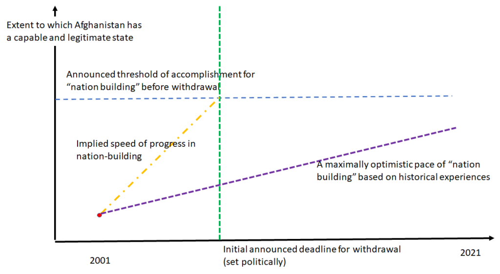
I am a very visual person so I propose this diagram as an aid to understanding the tragedy, for both the USA but much more so the people of Afghanistan, of the US engagement. After the US and its allies threw out the Taliban there were some critical choices. One choice was the extent to which the USA was going to engage in “nation building” and attempt to create a capable and legitimate state before leaving. The USA could have said “We are not in the business of nation-building, we are militarily out of here when our narrow 9/11 related objectives and met, full stop, plan on it.” Or, they could have said “Given the consequences of our regime change we are here with an open-ended commitment until Afghanistan has a capable and legitimate state (on some clear(ish) criteria.” But it was politically expedient, and the height of unconstrained hubris, to say both. The USA said that they were both going to leave only when Afghanistan had a capable and legitimate state and that, don’t worry, that won’t take us very long, we are not making an open ended commitment.
Well, if you announce a distance and a time, you have announced a speed. The USA announced was the equivalent of saying they were going to run a Marathon distance (26.2 miles) in an hour. And when they were told, hey, people having been running Marathons since, well, Marathon, and no one has run one in anything like that time (and it is probably physiologically impossible as no one has run even one single mile at the pace 26.2 would have to be run) the response was some mix of i) hubris that the US military can achieve anything; ii) real or feigned inability to understand that the speed was wildly unrealistic; iii) resignation to political interests setting the goal and timeframe).
Once the hubris of “we are going to build a capable and legitimate state and it is not going to take us that long” was set in motion the tragedy was underway, even if not immediately obvious, as it set in motion three practices that are inimical to building either a capable or a legitimate state.
First, if one is told to do nation building on an unrealistic time deadline one is driven towards tactics and strategies that can at least appear to produce rapid success. This leads inexorably towards what we call “looking like a state” or, after the sociological concept of isomorphism, “isomorphic mimicry.” It is super easy to do things on paper, make constitutions, pass legislation. What is hard to create is capability to implement, a shared sense of nation-hood, a commitment to rule of law.
Filmmakers cannot build space ships or cities but they can create the effective illusion of having done the impossible. Giving people resources and putting pressure on people to do the impossible will not lead to the impossible, it will lead them to create illusions.
A second major flaw that undermines development success is what we call “premature load bearing.” As I type this in August of 2021 I just had surgical repair of my ruptured Achilles tendon. My leg is in a hard, non-weightbearing cast for two weeks. If I took that cast off on the second day after surgery and tried to run around I would immediately undo whatever benefit the surgery had been.
Asking political and governance mechanisms to do too much, too soon, with too little merely creates repeated failures.
A third common flaw in development efforts is to “cocoon” projects from the normal channels of implementation. If one feels very strongly that something needs to be done and one knows that the existing national mechanisms are to weak to do it, there is a temptation to bring in foreign contractors and import the capability. Given the resources and capabilities of American government and contracting firms, of course many things can be done quickly. But this usually not just does not build capability, it both undermines the building of national capability and does not improve a government’s legitimacy. Moreover, this gets done at costs that are astronomical relative to what the national government could ever hope to afford. At one point great claims were being made about the improvements in the health sector and health outcomes in Afghanistan. Even if we grant those were major and important gains, since it was being done by American contractors it meant an Afghan doctor could make many-fold more income working as a driver for the health project than he could as a doctor in a regular government clinic. Back of the envelope calculations were that the cost per person of the health system exceeded not just the potential total government expenditure per person but total post-withdrawal GDP per capita.
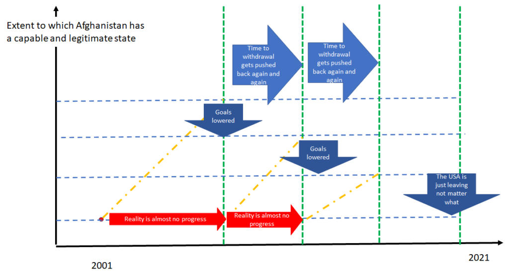
Figure 2 illustrates the dynamic in which the rash, overambitious commitments eventually confront a reality of little or no progress. Then, the political logic repeats itself. The USA either needs to leave, acknowledging they are doing so in spite of the fact there isn’t a capable and legitimate Afghan state in place, or, they need to push down the ambition and push out the time and try again. But the new attempts now face both the same politically set overambitious targets and the legacy of the past failed strategy and tactics. Increasingly the USA found itself integrated into, and part of, a corrupt policy: buying cooperation by turning an officially blind eye to corruption at the expense of democracy, rule of law, and legitimacy. This is how the tragedy gets long (and bipartisan).
The endgame, which many people both inside and outside of Afghanistan predicted, again and again from 2001 onwards was that eventually the USA would admit failure and announce they were getting out no matter what and try and put the best face on that fact.
I know personally, and have read about, many extraordinarily capable and well meaning people who sincerely worked at improving conditions in Afghanistan. But ultimately they all were powerless against the forces of tragedy set in motion. They became like the Earl of Kent, often speaking courageously against the madness:
Be Kent unmannerly When Lear is mad. What wouldst thou do, old man? Think’st thou that duty shall have dread to speak When power to flattery bows? To plainness honour’s bound When majesty falls to folly. Reverse thy doom; And in thy best consideration check This hideous rashness.
Only to be ignored be themselves banished, or, as Kent, finding a way to continue to struggle against the unfolding tragedy.
Afghanistan has deep and important lessons for nation-building, fragile states, conflict: issues which are an integral part of the practice of development. But I fear they are hard lessons to learn and even harder to convince politicians to swallow. I was working in South Sudan in 2011 and saw the exact pressures to announce as a “plan” a wildly overambitious pace of progress, often coming from “conflict” experts whose expertise rested on their experience in Afghanistan.
There were two recent entries in the ongoing saga of the “replication crisis.”
One was a recent (12/30/2020) blog post suggesting that the evidence behind Daniel Kahneman’s wildly popular Thinking, Fast and Slow was not every reliable as many of the studies were underpowered. (This was a follow up of a 2017 critique of Chapter 4 of the book about implicit priming, after which Kahneman acknowledged he had relied on under powered studies–and he himself pointed out this was borderline ironic as one of his earliest papers in the 1970s was about the dangers of relying excessively on under powered studies). The blog has a cool graph that estimates the replication rate of the studies cited, adjusting for publication bias and estimates the replication rate for studies cited in the book at 46 percent. The obvious issue is that so many studies are cited with very modest absolute value z-statistics (where 1.96 is the conventional “5 percent two sided statistical significance”).
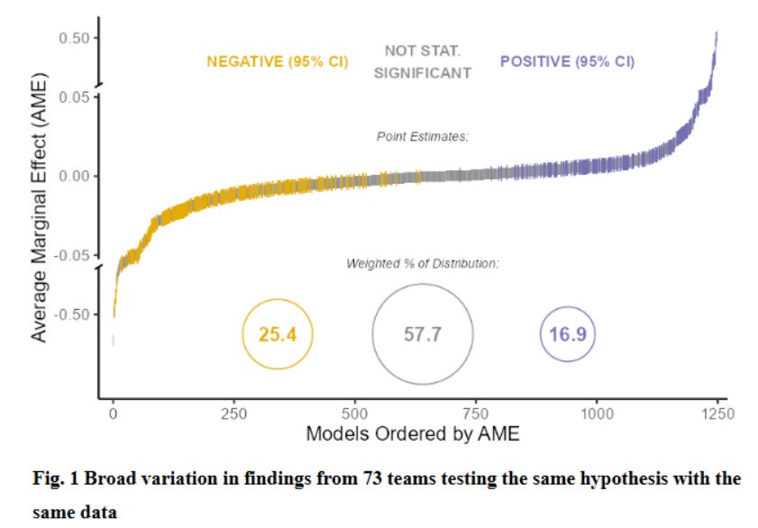
A second was an interesting blog reporting on three different studies about replication where various research teams were given exactly the same research question and the same data and asked to produce their best estimates and confidence intervals. The point is that the process of data cleaning, sample composition, variable definition, etc. involves many decisions that might seen common sense and innocuous but might affect results. Here is a graph from a paper that had 73 different teams. As one can see the results included a wide range of results and while the modal result was “not statistically significant” there were lots of negative and significant and lots of negative and significant (far more that “5 percent” would suggest).
This leads me to reflect how, in nearly 40 years of producing empirical results, I have dealt with these issues (and not always well).
I remember one thing I learned in econometrics class from Jerry Hausman when we were discussing the (then) new “robust” estimates of covariance matrices of the Newey-West and White type. His argument was that one should generally choose robustness over efficiency and start with a robust estimator. Then, you should ask yourself whether an efficient estimate of the covariance matrix is needed, in a practical sense. He said something like three things. (i) “If your t-statistic with a robust covariance matrix is 5 then why bother with reducing your standard errors with an efficient estimate anyway as all it is going to do is drive you t-statistic up and certainly you have better things to do.” (ii) “Would there be an practical value in a decision making sense?” That is, oftentimes in practical decision making one is going to do something is the estimate is greater than a threshold value. If your point estimate is already 5 standard errors from the threshold value then, move on. (iii) “if moving from a robust to an efficient standard error is going to make the difference in ‘statistical significance’, you are being dumb and or a fraud.” That is, if the t-statistic on your “favorite” variable (the one the paper/study is about) is 1.85 with a robust estimator but with an efficient (non-robust) estimator is 2.02 and you are going to test and then “fail to reject” the null of heteroskedasticity in order to use the efficient standard error estimate so that you can put a star (literally) on your favorite variable and claim it is “statistically significant” this is almost certainly BS.
One way of avoiding “replication” problems with your own research is to adopt something like a “five sigma” standard. That if your t-test is near 2 or 2.5 or even 3 (and I am using “t-test” just as shorthand, I really mean if the p-value on your H0 test is .01 or even .001) then the evidence is not really overwhelming whereas a p-level in the one in a million or one in a billion is much more reassuring that some modest change in method is not going to change results. In Physics there is some use that 3 sigma is “evidence for” but a “discovery” requires 5 sigma (about one in 3.5 million) evidence.
But then the question for younger academics and researchers is: “But isn’t everything that can be shown at 5 sigma levels already known?” Sure I could estimate an Engel curve from HH data and get a 5 sigma coefficient–but that is not new or interesting. The pressure to be new and interesting in order to get attention to one’s results is often what leads to the bias towards unreliable results as the “unexpectedly big” finding gets attention–and then precisely these fail to replicate.
Of course one way to deal with this is to “feign ignorance” and create a false version of what is “known” or “believed” (what actual beliefs are) so that your 5 sigma result seems new. Although this has worked well for the RCT crowd (e.g. publishing an RCT finding that kids are more likely to go to school if there is a school near them as if that were new) I don’t recommend it as real experts see it as the pathetic ploy that it is.
Here are some examples of empirical work of mine that has been 5 sigma and reliable but nevertheless got attention as examples of situations in which this is possible.
Digging into the datato address a big conceptual debate. In 1994 I published a paper showing that, across countries, actual fertility rates and “desired” fertility rates (however measured) were highly correlated and, although there is excess fertility of actual over desired, this excess fertility was roughly constant across countries and hence did not explain the variation in fertility rates across countries. I used the available Demographic and Health Surveys (DHS) in the empirical work. Since my paper several authors have revisited the findings using only data from DHS surveys carried out since my paper and the results replicate nearly exactly (and this is strong than “replication” this is more “reliability” or “reproducibility” in other samples and out of sample stability is, in and of itself, an kind of omnibus specification test of a relationship).
But then the question is, how was this 5 sigma result new and interesting? Well, there were other 5 sigma results that showed a strong cross-national correlation in the DHS data between TFR and contraceptive prevalence. So the question was whether that relationship was driven by supply (the more contraception is available the higher the use and the lower the TFR) or whether than relationship was driven by demand (when women wanted fewer children they were more likely to use contraception). There were a fair number of people arguing (often implicitly) that the relationship was driven by supply and hence greater supply would causally lead to (much) lower TFR.
It was reasonably well known that the DHS data had a survey response from women about their “ideal” number of children but the obvious and persuasive criticism to that was that women would be reluctant to admit that a child they had was not wanted or past their “ideal” and hence a tight correlation of expressed ideal number of children and TFR might not reflect “demand” but “ex post rationalization.”
What made the paper therefore a paper was to dig into the DHS reports and see that the DHS reported women’s future fertility desires by parity. So one could see the fraction of women who reported wanting to have another child (either now or in the future) who had, say, 2, 4 or 6 existing births. This was a measure of demand that was arguably free of ex post rationalization and arguably a reliable indicator of flow (not stock) demand for fertility.
With this data one could show that nearly all cross-national variation in actual TFR was associated with variation in women’s expressed expressed demand for children and that, conditional on expressed demand, the “supply” of contraception relationship was quite weak. And this finding has proved stable over time–Gunther and Harttgen 2016 replicate the main results using only data that has been produced since the paper and replicate the main findings almost exactly (with the exception that the relationship appears to have weakened somewhat in Africa).
Use some (compelling) outside logic to put debates based on existing data in a new light. In 1997 I published a paper Divergence, Big Time arguing that, over the long sweep of history (or since, say, “modern” growth in the developed world in 1870) there has been a massive increase in the dispersion of GDP per capita (in PPP). This paper was written as a counter-weight to the massive attention “convergence” was getting as it was seen that in the debate between “neoclassical” and “endogenous” growth models the question of “convergence” or “conditional convergence” was seen as critical as it was argued that standard Solow-Swan growth models implied conditional convergence whereas with endogenous growth models one could get differences in steady state growth rates and hence long term divergence (which, among others, Robert Solow regarded as a bug, not a feature as it implied levels of output could go to (essentially) infinity in finite time).
Anyway, at the time there was PPP data for most countries only since about 1960 and hence the analysis could only look at the 1960-1990 (or updated) period or one had historical data but nearly all the countries with reliable GDP data going back to 1870 were “developed” and hence the historical data was endogenous to being rich and hence could not answer the question. So, although everyone kind of intuitively knew the “hockey stick” take-off of growth implied divergence there was no accepted way to document the magnitude of divergence because we did not have GDP per capita data for, say, Ghana or Indonesia in 1870 on a comparable basis.
The key trick that made a paper possible was bringing some logic to bear and making the argument that GDP per capita has a lower bound as a demographically sustainable population requires at least some minimum level of output. So, for any given lower bound the highest the dispersion could have been historically was if each country with data was where the data said it was and each country without data were at the lower bound. Therefore one could compare an upper bound on historical dispersion with actual observed dispersion and show current dispersion was, in absolute numbers, an order of magnitude larger. Hence not just “divergence” but “divergence, big time” (and 5 sigma differences).
The main point here is that sometimes one can make progress by bringing some common sense into numbers made comparable to existing data. So everyone knows that people have to eat to stay alive, I just said “what would be the GDP per capita of a country that produced just enough food to produce caloric adequacy sufficient for demographic stability (e.g. not famine situation)” to create a lower bound from common sense comparable to GDP data (and then uses overlapping methods of triangulation to increase confidence).
Combine data not normally combined. In the “Place Premium” paper with Michael Clemens and Claudio Montenegro we estimate the wage gain of moving an equal intrinsic productivity worker from their country to the USA. Here everyone knew that wages were very different across countries but the question was how much of that was because of a movement “along” a wage relationship (say, along a Mincer curve, where average wages differ because the populations had different levels of education) and how much was a place specific difference in the wage relationships. So while there were literally thousands of Mincer-style wage regressions and probably hundreds of papers estimate the differences in wages between natives and migrants in the same country there were not any estimates of the gap between wages between observationally equivalent workers in two different places. So the main insight of this paper is that Claudio, as part of his research at the World Bank, had assembled a collection of labor force surveys from many countries and that the US data had information on people’s income and their birth country and at what age they moved to the USA. So we could, for any given country, say, Guatemala, estimate a wage regression for people born in Guatemala, educated in Guatemala, but now working the USA to a wage regression for people born in Guatemala, educated in Guatemala and working in Guatemala and therefore compute the wage gap for observationally equivalent workers between the two places. And we could do this for 40 countries. Of course we then had to worry a lot about how well “observational equivalent” implied “equal intrinsic (person specific) productivity” given that those who moved were self-selected, but at least we had a wage gap to start from.
The key insight here was to take the bold decision to combine data sets whereas all of the existing labor market studies did analysis on each of these data sets separately.
Shift the hypothesis being tested to an theoretically meaningful hypothesis. My paper “Where has all the education gone?” showed that a standard construction of a measure of the growth of “schooling capital” that these measures were not robustly associated with GDP per capita growth. One thing about the robustness of this paper is that I used multiple, independently constructed measures of schooling and of “physical” capital and of GDP per capita to be sure the results were not a fluke of a particular data set or measurement error.
The more important thing from my point of view was that I pointed out that the main reason to use macro-economic data to estimate returns to schooling was to test whether or not the the aggregate return was higher than the private return. That is, there are thousands of “Mincer” regressions showing that people with more schooling have higher wages. But that fact, in and of itself has no “policy” implications (any more so than the return to the stock market does). A commonly cited justification for government spending on schooling was that there were positive spillovers and hence the public/aggregate return to schooling was higher than the private return. Therefore the (or at least “a”) relevant hypothesis test was not whether the coefficient in a growth regression was zero but whether the regression was higher than the microeconomic/”Mincer” regressions would suggest it should be. This meant that since the coefficient should be about .3 (the human capital share in a production function) this turned a “failure to reject zero” into a rejection of .3 at very high significance level (or, if one wanted to be cheeky, high significance level rejection that human capital did not have a negative effect on standard measures of TFP).
(As an addendum to the “Where has all the education gone?” paper I did a review/Handbook chapter paper that could “encompass” all existing results within a functional form with parametric variation that was based on a parameter that could be estimated with observables and hence the differences in results were not random but I could show how to get from my result to other results that appeared different than mine just by varying a single parameter).
Do the robustness by estimating the same thing for many countries. In some cases there are data sets that collect the same data for many countries. A case in point is the Demographic and Health Surveys, which have repeated nearly exactly the same survey instrument in many countries, often many times. This allows one to estimate exactly the same regression for each country/survey separately. This has several advantages. One, you cannot really “data mine” as in the end you have to commit to the same specification for each country. Whereas working with a single data set there are just too many ways in which one can fit the data to one’s hypothesis (a temptation that of course RCTs do not solve as there are so many questions that have not definitively “right” answer that can affect results, see for instance, a detailed exploration of why the findings of an RCT about the impact of micro-credit in Morocco depended on particular–and peculiar–assumptions in variable construction and data cleaning (the link includes a back and forth with the authors)) whereas if one estimates the same regression for 50 countries the results are reported for each with the same specification. Two, one already has the variance of results likely to be expected across replications. If I estimate the same regression for 50 countries I already have not just an average but I also already have an entire distribution, so that if someone does the same regression for one additional country one can see where that new country stands in the previous distribution of the 50 previous estimates. Three, the aggregated results will be effectively using tens of thousands or millions of observations for the estimate of the “typical” value will often have six sigma precision.
This approach is, of course, somewhat harder to generate new and interesting findings as existing, comparable, data are often well explored. I have a recently published paper about the impact of not just “schooling” but schooling and learning separately with the DHS data that is an example of generating a distribution of results (Kaffenberger and Pritchett 2021) and a recent paper with Martina Viarengo (2021) doing analysis of seven countries with the new PISA-D data, but only time will tell what the citations will be. But, for instance, Le Nestour, Muscovitz, and Sandefur (2020) have a paper that estimates the evolution over time within countries of the likelihood a woman completing grade 5 (but no higher) can read that I think are going to make a huge splash.
Wait for prominent people to say things that wrong to first order. For a wide variety of reasons people will come to want things to be true that just aren’t. For instance, JPAL had an op-ed that claimed that targeted programs were “equally important” with economic growth in reducing poverty (to be fair, this was the Executive Director and PR person for JPAL, “Poor Economics” just hints at that as the authors are too crafty to say it). That claim is easy to show is wrong, at least by a order of magnitude (Pritchett 2020). Or, many people in development have begun to claim that GDP per capita is not reliably associated with improvements in well-being (like health and education and access to safe water) which is easy to refuted (even with their own data, strangely) at six sigma levels (Pritchett 2021).
The famous theater Carnegie Hall (note 1) is located in Manhattan on the east side of Seventh Avenue between 58th and 57th, hence between Central Park 59th and Times Square at 42nd. Suppose I observe someone walk down the east side of Seventh Avenue from Central Park (59th) to Times Square (42nd) and then I stop them and say: “If you are headed for Carnegie Hall you should turn around and walk back up the east side of Seventh Avenue to 57th Street.”
Can that statement of correct directions to Carnegie Hall be considered “advice” or a “recommendation” to the person I stopped? I think not. I think the prima facie and best interpretation of the person’s behavior is that they were not going to Carnegie Hall at the time. I would guess if I made this “recommendation” 10,000 times I would be very surprised if even once the response was: “Gee thanks mister, I was headed to Carnegie Hall but didn’t know how to get there and I am a little chagrined I walked right past it.”
I don’t think it properly counts as “advice” or a “recommendation” to give people conditional information: “if you want to achieve X, do Y” if there is no evidence they want to do X and, even more so, if the best available evidence from their observed behavior is that they don’t (currently) want to do X.
Now a personal story about “best buys” in education (or policy advice based on empirical estimates of cost effectiveness).
An early attempt to do “best buys” (or “smart buys”) was the Copenhagen Consensus which was an attempt to give expert and evidence informed recommendations as to how to best spend some given amount of money, like $25 billion, to promote human wellbeing. The process was, step 1, to choose a variety of potential domains in which there might be cost effective spending opportunities (e.g. education, health, corruption, water and sanitation) and hire an expert in each of those domains review the available evidence and then rank, with specific estimates, the most cost-effective “interventions” or “actions” and produce a “challenge” paper addressing the various challenges. Then, the Copenhagen Consensus process was that (step 2) the expert chapters would be read by two other experts who would provide comments and (step 3) the chapter authors and the discussants in each domain would present their findings and evidence to an expert panel. Step 4, the panel would then produce a “consensus” of the most cost effective ways to improve human wellbeing (note 2).
I was hired to write the education challenge paper. I wrote a long paper that had an explication of the simple producer theory of maximizing subject to constraints, a review of the literature of empirical estimates of the cost effectiveness, I then pointed out that if we were assuming “normative as positive”–that is, that our positive, descriptive, theory of the behavior of the producers of education–then this had (at least) four empirical implications and that all of those were, at least in many countries and instances rejected by very strong evidence.
In particular, my paper, drawing on my previous work with Deon Filmer “What education production functions really show” I pointed out that an empirical implication of normative producer theory with a multi-input production function was that the marginal gain in the producer’s objective function per dollar of spending on each input should be equalized. This implied that, if the evidence pointed to one particular input had a very, very high cost-effectivenessin producing a given output (say, some measure of learning gain per year of schooling) then this was prima facie evidence the producer choosing the input mix was maximizing that output. Therefore this evidence was evidence against “normative as positive”–that producers were actually maximizing an education output with choice of inputs–and therefore one could not–as it was not internally coherent–use that evidence to make “recommendations” on the assumption that the producer was maximizing. (The connection to the analogy is obvious, I cannot stop people who have walked right by Carnegie Hall and given then “recommendations” about how to get to Carnegie Hall and expect that to change their behavior as the best interpretation of their behavior is that they were not trying to get to Carnegie Hall at the time).
In my challenge paper I gave reasons why “recommendations” about how to improve education had to be based on a correct positive model of what education producers were actually doing and why and I made some suggestions of what such a model might look like. And in doing so, I explicitly explained why I was therefore not going to provide a list of “cost effective” (“best buy” or “smart buy”) actions or interventions in education, in spite of having presented empirical evidence that often showed there existed highly cost effective actions.
I submitted my paper. The organizers got back to me and pointed out I did not provide them with a list of “best buys” to be compared by the panel to other domains. I said yes, I was aware of that and that I thought my paper was an excellent guide of what might be done to improve education but that imagining there were discrete, compartmentalizable, actions that were “cost effective” and “recommending” those as ways for some outsider to spend money was not a way to improve education, one needed to think about education systems as systems and understand them.
The organizers then pointed out that the Terms of Reference of the output they were paying me X thousand dollars for (where I honestly don’t remember X but was on the order of $10,000) included that I provide them such a list and that I had already taken half of the payment up front. I acknowledged that, apologized for not having read and interpreted the TOR correctly, and offered to both not take the second payment on the contract but moreover, I would be happy to give the first half paid in advance back. I pointed out that it wasn’t just that I thought the evidence was too weak (not “rigorous” enough) I thought the idea of making recommendations based evidence and a positive model of the agents/actors to whom you were giving “recommendations” when the evidence was inconsistent with the positive model was intellectually incoherent, contradictory, and hence untenable. I would rather give up payments after I had done a massive amount of work rather than have my name associated with things that were so intellectually indefensible. I would not sell them “best buys.”
The final “challenge” paper I think remains a great short introduction into the economics of education.
In the end they relented as they were faced with the prospect of not having “education” as one of their considered domains, but, since I had not provided a list the expert panel list I don’t think (I did not pay that much attention to the overall process) had any education “interventions” in their top 10. The Copenhagen Consensus was repeated and in the next round, not surprisingly, they chose a different expert but, to their credit, I was asked to be a discussant and hence could articulate again my objections (although I went light on the “normative as positive” point).
None of my 2004 objections to the “normative as positive” contradictions in using evidence from studies of cost-effectiveness of individual interventions (no matter how “rigorous” these estimates are) to make “recommendations” have been addressed.
Rather, what has happened often illustrates exactly my points. Three examples, one from Kenya, one from India and one from Nigeria.
Duflo, Dupas and Kremer ( 2015) did a RCT study estimating the impact of reducing class sizes in early grades in Kenya from very high levels and there was a control group and four treatment arms from two options (2 by 2); (a) either the teacher was hired on a regular civil service appointment or was hired on a contract and (b) the additional classroom was divided on student scores or not. The results were that the “business as usual” reduction in class size (civil service appointment–non-tracked classrooms) had a very small (not statistically different from zero impact) whereas the contract teacher reduced class sizes had impacts on producing learning both in tracked and untracked treatment arms.
In a JPAL table showing the “rigorous” evidence about cost effectiveness (on which things like “best buys” or “smart buys” are based) this appears as “contract teachers” being an infinitely cost effective intervention.
Of course in any normative producer theory the existence of an infinitely cost effective input should set off loud, klaxon volume, warning bells: “Oooga! Oooga!” This finding is, in and of itself, a rejection of the model that the producer is efficient (as it cannot be the case that the cost effectiveness of all inputs is being equalized if one of them is infinite). So I cannot maintain as even semi-plausible that my positive theory of this producer is that they are maximizing the measured outcome subject to budget constraints. But if that isn’t my positive model what is? And in a viable positive model of producer behavior what would be the reaction to the “recommendation” of contract teachers and what would be the outcome?
The reason I used the Kenyan example is that the Kenyan government decided to scale up the reduction in class size using contract teachers. A group of researchers did an RCT of the impact of this scaling. The Kenyan government did not have capability to scale the program nationwide so they had an NGO do parts of the country and the government do parts of the country. The researchers (Bold, Kimenyi, Mwabu, Ng’ang’a, and Sandefur 2018) found that in the government implemented scaling up there was zero impact on learning. So an infinitely cost-effective intervention when done by an NGO–a “best buy”–had zero impact when actually scaled by government and so was not at all a “best buy.”
Another example comes from the state of Madhya Pradesh India where the state adopted at scale a “school improvement plan” project that was based on the experience of doing a similar approach in the UK. A recent paper by Muralidharan and Singh 2020 reports that the project was implemented, in the narrow sense of compliance: schools did in fact prepare school improvement plans. But overall there was zero impact on learning (and not just “fail to reject zero” but in early results the estimated impact on learning was zero to three digits) and the zero impact was consistent with estimates that, other than doing the school improvement plan nothing else changed in the behavior of anyone: teachers, principals, supervisors. So whether “school improvement plans” were or were not a “best buy” in some other context, they had zero impact at scale in Madhya Pradesh.
A third example is from a (forthcoming–wiil update) paper by Masooda Bano (2021) looking at the implementation of School Based Management Committees (SBMC) in Nigeria. In a qualitative examination of why SBMC seem to have little or no impact in the Nigeria context she finds that those responsible for implementation really don’t believe in SBMC or want them to succeed but see the going through the motions of doing SBMC as a convenient form of isomorphism as the donors like it and therefore the pretense of SBMC keeps the donors complacent. So, whatever evidence there might be that when well designed and well implemented SBMC can be cost effective is irrelevant to the cost effectiveness of SBMC in practice in Nigeria.
My point is not just another illustration of the lack of “external validity” of empirical estimates of cost-effectiveness, it is deeper than that. It is the point of the intellectual incoherence of making “recommendations” based on positive model of producer behavior (that producers are attempting to maximize an outcome subject to constraints) that the empirical estimates themselves are part of the evidence that rejects this positive model.
Let me end with a different analogy of “best buys.”
Suppose I have just read that spinach and broccoli are “cost effective” foods in providing high nutritional content at low prices. I am in the grocery store and see a fellow shopper whose cart is loaded with food that is both bad for you and expensive (e.g. sugared breakfast cereals) and nothing really nutritious. I could then go up to her/him and make a “recommendation” and give him/her my empirical evidence grounded “smart buy” advice: “Hello stranger, you should buy some broccoli because it is a cost effective source of vitamins.” One can imagine many outcomes from this but perhaps the least plausible response is: “Gee thanks, fellow stranger, I will now buy some broccoli and integrate this cost effective source of vitamins into my regular food consumption habits.”
Take the analogy a step further and suppose I have an altruistic interest in the health of my fellow shopper and so I just buy and broccoli and spinach and put it into his/her shopping bags for free. Again, one can imagine many outcomes from this action of mine, but I would think the most probable is that some broccoli and spinach gets thrown away.
“Smart buys” is just dumb (worse than dumb, as believing things that are false is very very common and easy to do–most of us do it most of the time about most topics–but believing things that are internally contradictory (“I believe both A and not A”) takes some additional mental effort to stick to an attractive but dumb idea). As my story illustrates, I personally would give up substantial sums of money rather than have my name associated with this approach. I will not sell “best buys.” Given the poor track record of slogging “best buy” evidence that then does not deliver in implementation in context, you should be wary of buying it.
Note 1) The reason I use directions Carnegie Hall is because there is the old joke about it. One person stops another on the street and asks: “Do you know how I can get to Carnegie Hall?” the answer: “Practice, practice, practice.”
Note 2) This Copenhagen Consensus process was called such because it was instigated and led by Bjorn Lomborg (who was based out of some organization in Copenhagen) and the not so hidden agenda was to just inform people that on the available evidence about the likely distribution of possible consequences of climate change and the likely costs of avoiding those consequences one need not be a “climate change denialist” to acknowledge the world had lots and lots of current and future problems and action on climate change should be compared/contrasted to other possible uses of scarce resources. So might discredit the exercise for this reason but one could (a) none of the domain experts in their sector papers had or were asked to form any view about climate change and (b) one can bracket the climate change estimates from the expert panel and the ranking within and across domains is unaffected. So whether you think climate change was unfairly treated in this process vis a vis education or health or nutrition, each of those was treated equally and, as best as I could tell, there wasn’t any bias across the other domains.
I also have a new paper that argues that the current conventional wisdom about “rigorous evidence” in policy making is just empirically wrong. That is, a current conventional wisdom is that, because of the dangers of a lack of internal validity of estimates of causal impact (LATE) one needs to do RCTs. Then, after doing some number of those, one should do a “systematic review” that aggregates those “rigorous” estimates and policy making should be “evidence based” and rely on these systematic reviews. The paper shows, with real world data across countries, that this approach actually produces larger prediction error in causal impact than if each country just relied on its own internally biased estimates.
A simple analogy is I helpful. Suppose all men lie about their height and claim to be 1 inch taller than they actually are. Then self-reported height is internally biased. One could do a study of produce “rigorous” estimate of the true height of men and have the distribution of true heights, which has a mean (say, 69 inches (5′ 9”) and a standard deviation (3 inches). Then suppose I want to predict Bob’s height. If I don’t know anything about Bob then 69 inches is my best guess. But suppose I do have Bob’s self-reported height and he says he is 6′ 3” (75 inches tall). The conventional wisdom of “RCTs plus systematic review” approach would tell us to guess 69 inches and ignore altogether Bob’s self-report because it is not a “rigorous” estimate of Bob’s height because it isn’t internally valid and is biased. But in this case that approach is obvious madness. We should guess that not that Bob is 69 inches but that he is 6’2” (74 inches) tall and if Fred says he is 5’5” (65 inches) we should guess not 69 inches but 64 inches.
The obvious point is that the prediction error across a number of cases depends on the relative magnitude of the true heterogeneity in the LATE across contexts versus the magnitude of internal bias in a given context. There is no scientifically defensible case for using the mean of the set of “rigorous” estimates as the context specific estimate of the LATE (the proposed “conventional wisdom”) in the absence of (a) specific and defensible claims about the heterogeneity of the true LATE across contexts (and the available evidence suggests heterogeneity of LATE is large) and the typical magnitude and heterogeneity of the internal bias from various context specific estimates (about which we know little).
The paper (which is a homage to Ed Leamer’s classic “Let’s take the con out of econometrics” paper)–and which is still a draft–illustrates this point with data about estimates of the private sector learning premium across countries, where I show that both the heterogeneity across countries in the estimates are large and the internal bias is also large and that the net is the the “rigorous estimates plus systematic review” approach produces larger RMSE (root mean square error) of prediction that just using the OLS estimate (adjusting estimates for student HH SES) for each country.
This blog is just a bit of background about the attached paper, which is still an early draft, circulated for comments.
There is a big debate within the field of development between those who believe that the promotion of “national development” (a four fold transformation of countries to a more productive economy, a more capable administration, a more responsive government and generally more equal treatment of all citizens) will lead to higher wellbeing and those who think that “national development”–and in particular, “economic growth” is overrated as a means to produce human well being. The alternative is to focus more directly on specific, physical, indicators of human wellbeing, with the idea that this “focus” on the “small” can lead somehow to “big” gains.
The attached paper examines indices and data on country level human wellbeing from Social Progress Imperative whose mission statement involves creating a Social Progress Index as part of their advocacy against the use of economic indicators:
We dream of a world in which people come first. A world where families are safe, healthy and free. Economic development is important, but strong economies alone do not guarantee strong societies. If people lack the most basic human necessities, the building blocks to improve their quality of life, a healthy environment and the opportunity to reach their full potential, a society is failing no matter what the economic numbers say.
The Social Progress Index is a new way to define the success of our societies. It is a comprehensive measure of real quality of life, independent of economic indicators.
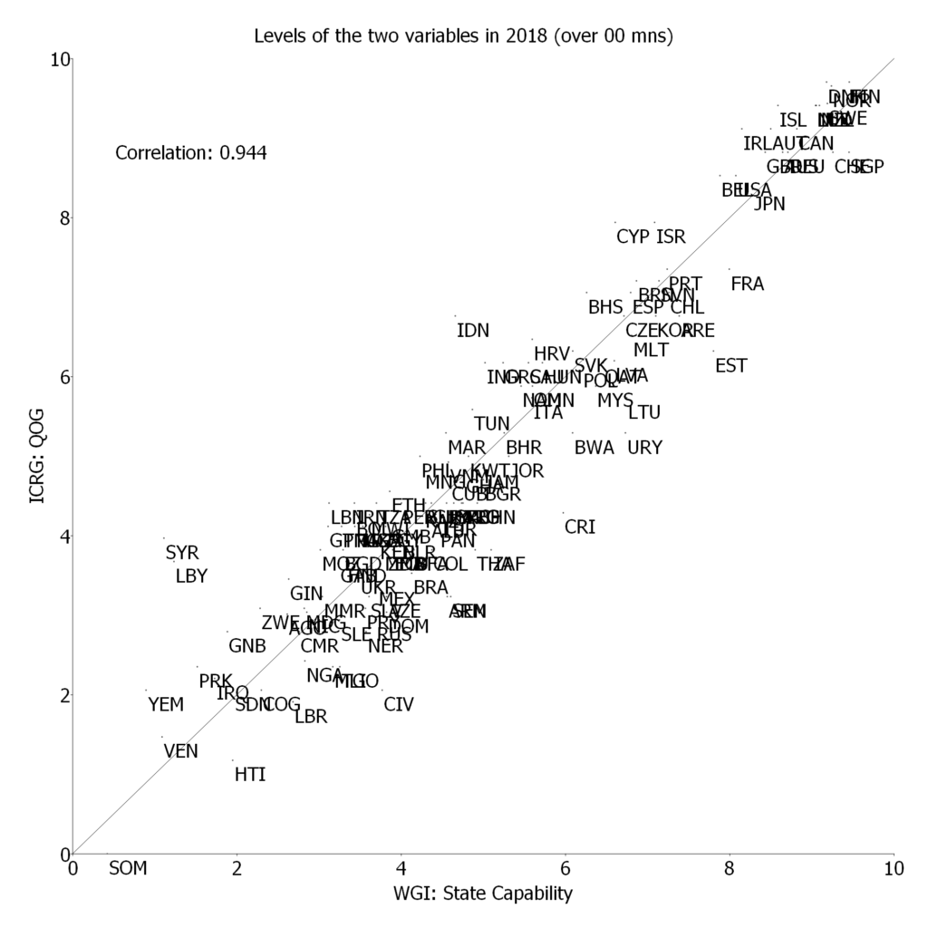
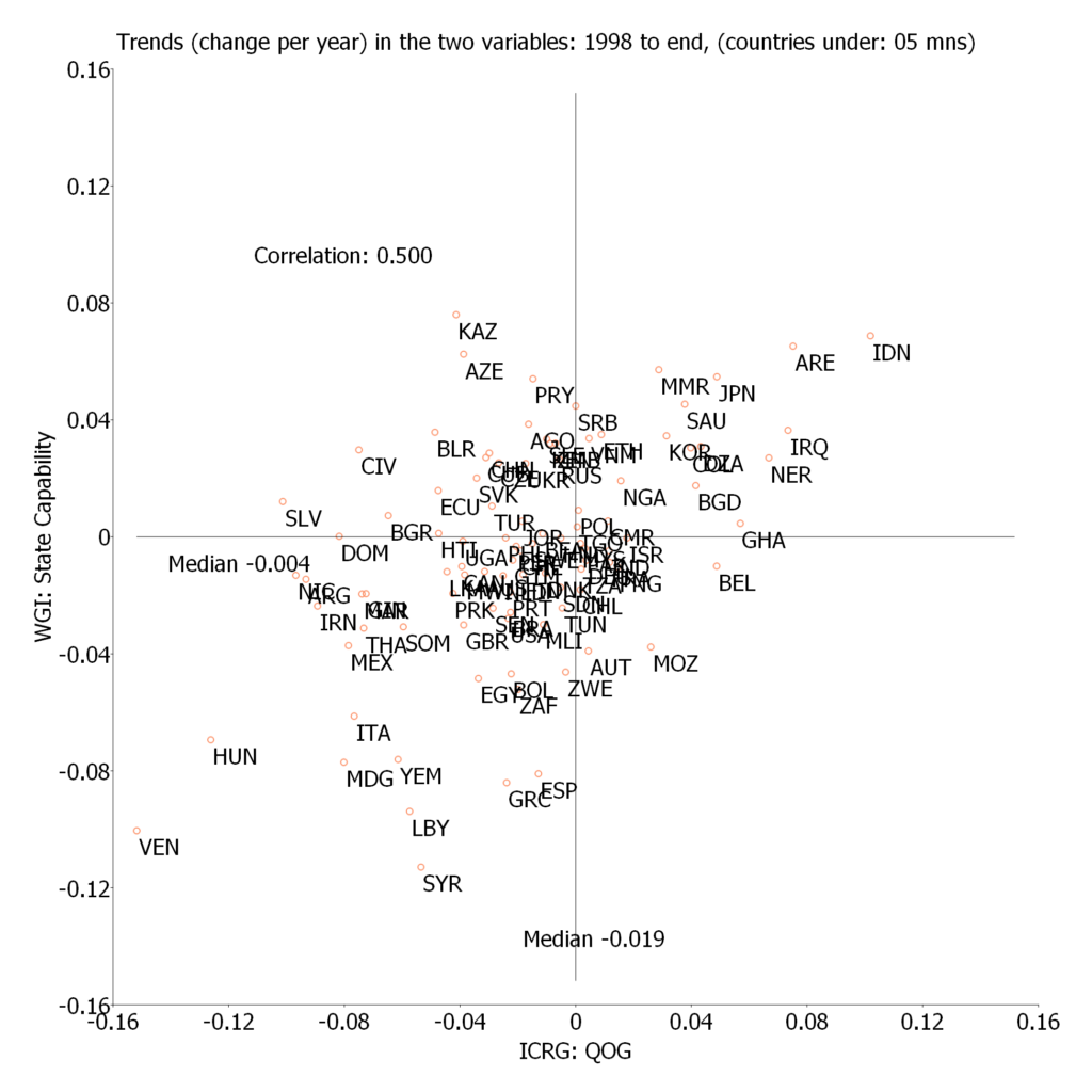
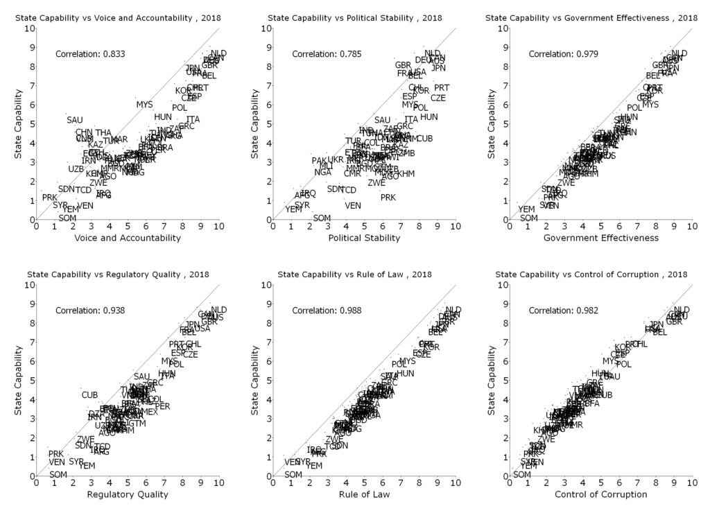
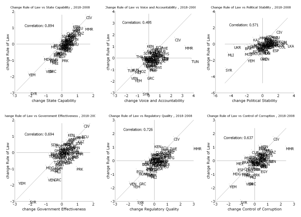
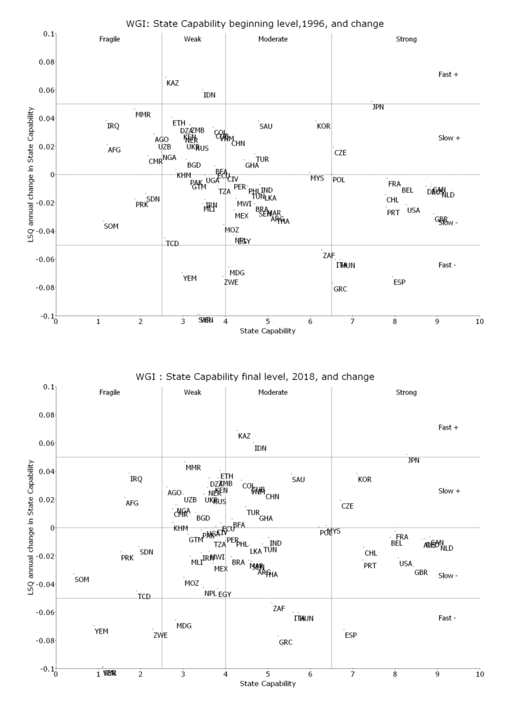
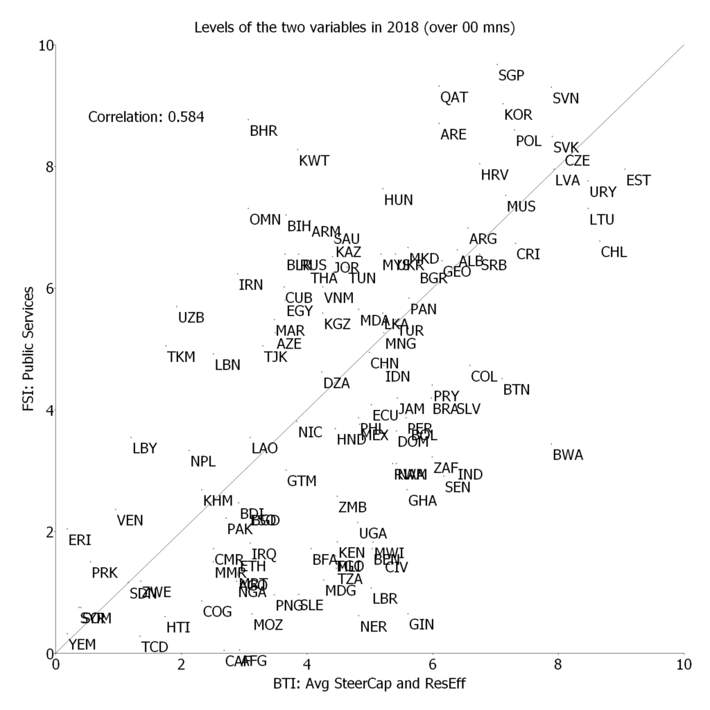
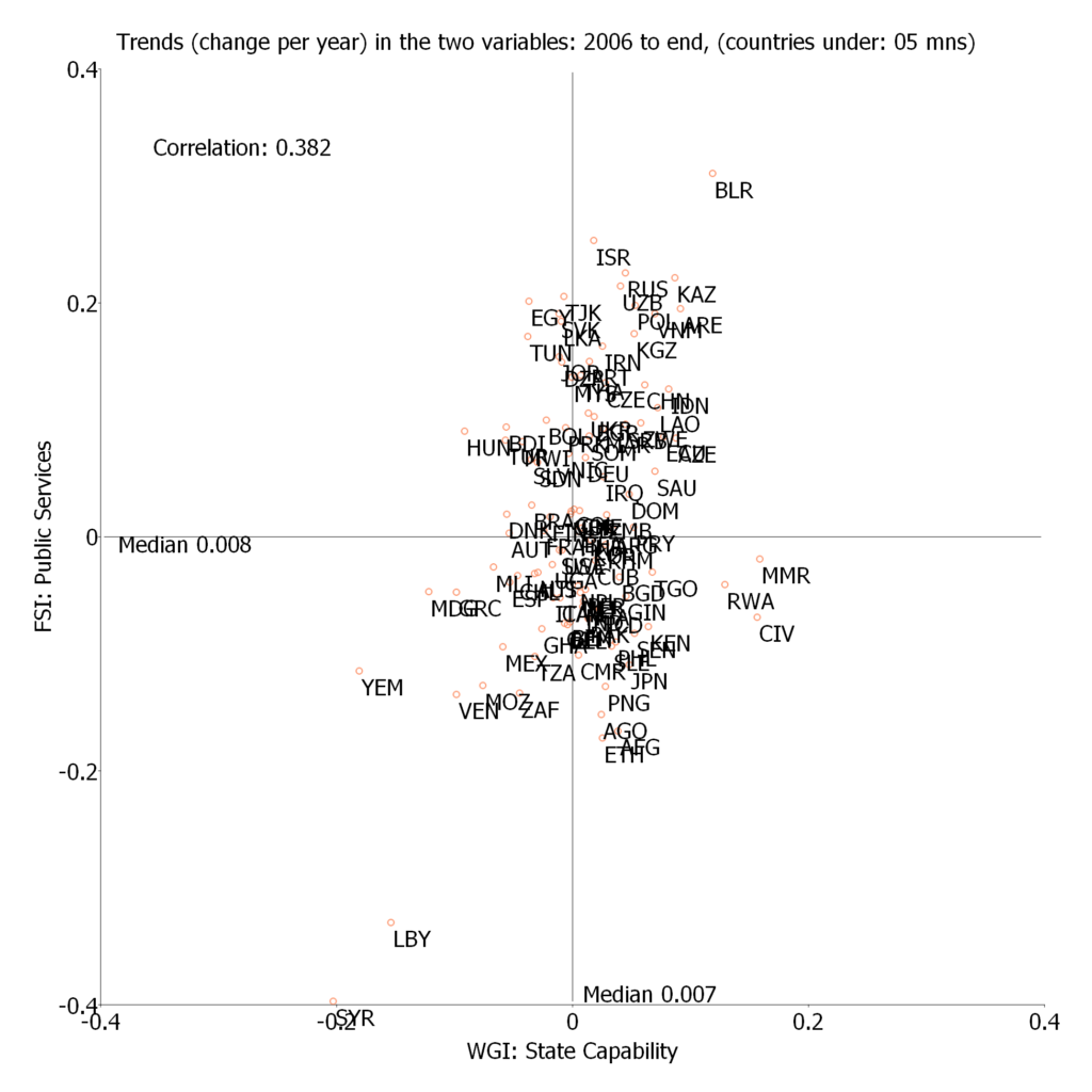
In the paper I examine the empirical connections between the Social Progress Index, its components, subcomponents, and indicators, and three measures of national development: GDP per capita, state capability, and democracy. One basic finding is that for the Social Progress Index and its three major components the relationship between country measures of human wellbeing and national development is very, very, strong. Put another way, national development is both empirically necessary (there are no countries with high human wellbeing and low national development) and empirically sufficient (there are not countries with high national development and low human wellbeing).
The paper is much more interesting than just that as I explore the relationship between the various components of the Social Progress Index and the components of national development (e.g. how much does GDP per capita versus state capability matter for access to sanitation versus personal freedom, or indoor air pollution deaths than outdoor air pollution deaths). This leads to a set of what I argued are both interesting but ultimately intuitive findings.
{There is a new edited book about RCTs from Oxford University Press called Randomized Control Trials in the Field of Development. I have a chapter in it and other than that it is really excellent, with contributions from Agnus Deaton, James Heckman, Martin Ravallion and contributions about the rhetoric of RCTs, the ethics, and interested interviews from actual “policy makers” (from France’s development agency and from India) about their view of the value of RCTs. This book coming out has led me to go back and put into the public domain some things I wrote but did not post yet, like this (long) post about the weird methodological stance and approach the RCT crowds has adopted.}
Let me start with a discussion of a single paper that I believe illustrates an important methodological point that is, in many ways, at the core of many disputes about the value of RCTs.
The paper is “Bringing Education to Afghan Girls: A Randomized Control Trial of Village-based Schools” by Dana Burde and Leigh Linden. It published in one of the highest prestige journals in economics American Economic Journal: Applied Economics. I choose this paper because it is a paper with sound methods and clear findings and its authors are superb and experienced researchers. That is, nothing I am going to say is a critique of this paper or its authors. I chose a strong paper because the paper is just a vehicle for commentary on the more general intellectual stance and milieu and approach to “evidence” and hence the stronger the paper the clearer it makes the more general methodological point.
Here is the paper’s abstract:
We conduct a randomized evaluation of the effect of village-based schools on children’s academic performance using a sample of 31 villages and 1,490 children in rural northwestern Afghanistan. The program significantly increases enrollment and test scores among all children, but particularly for girls. Girls’ enrollment increases by 52 percentage points and their average test scores increase by 0.65 standard deviations. The effect is large enough that it eliminates the gender gap in enrollment and dramatically reduces differences in test scores. Boys’ enrollment increases by 35 percentage points, and average test scores increase by 0.40 standard deviations.
So. An RCT was done that provided 13 villages (?!) in one region of one country with “village-based” schools in year one (and to the other villages in year 2). The findings were that that reducing proximity to schools increases enrollment for boys and girls, increased enrollment leads to increased learning and the effect was differentially larger for girls.
All of us who have published papers in economics know how incredibly frustrating and difficult that process is. The top journals have very high rejection rates (on top of author’s self-selection on journal quality in submission decisions). Top journals reject most papers not because they are unsound or incorrect because they are “not of general interest” or not sufficiently “important.”
So the key question is: how is a paper based on the treatment of 13 villages in Northwestern Afghanistan sufficiently interesting and important to justify publication in a top journal when its findings confirm what everyone already believes (and has for a very long time).
Here are four things one has to feign ignorance of (or at least feign their irrelevance) in order for this paper to be the kind of interesting and important “contribution to knowledge” one expects in a top journal. Note that I am not saying the authors of this paper were in fact ignorant of these things, there were not because (a) the authors are intelligent and capable researchers with experience in education and (b) these are facts that pretty much everyone, even non-experts,knows. As I come back to below, one has to work one’s way into very special mindset to ignore the obvious, but that this mindset has, strangely, become popular.
First, one has to feign ignorance of the fact pretty much every government in the world has, for 50 years or more, based their core education policies on the presumption that (a) proximity matters for enrollment and attendance decisions and that (b) kids learn in school. This paper therefore confirms a belief that has been the foundation of schooling policy for every government in the world for decades and decades. To justify this paper showing “proximity matters” as “new” and “important” knowledge one has to use feigned ignorance to imagine that all governments might have been wrong all this time—but they weren’t but they now know what they already knew is some importantly different way.
Second, one has to feign ignorance of the fact that schooling in the developing world has expanded massively over the last 50 years, accompanied by a massive expansion of schools that dramatically increased proximity. Even a cursory look at the widely available Barro-Lee data on schooling (versions of which have been available for 25 years) shows that average schooling of the work force aged population in the developing world has increased massively (from 2.1 years in 1960 to 7.5 years in 2010). It is widely accepted that the increase in the proximity of schools facilitated this expansion of schooling. To justify this new paper as important, publishable, new knowledge one has to adopt the feigned ignorance view that: “yes, completed schooling has expanded massively in nearly every country in the world and yes, that happened while more and more schools were being built–but we can imagine this might have been an empirical coincidence with no causal connection at all.”
Third, one has to feign ignorance of a massive empirical literature, with literally hundreds (perhaps thousands of papers) showing an empirical association between enrollment and proximity. The overwhelming conclusion of this literature is that proximity matters. How does one justify that a paper that says “proximity matters” is a sufficiently new and interesting finding to justify publication in a top journal? One has to adopt the view that: “Yes, there is a massive empirical literature showing an empirical association between child enrollment and distance to school–but one can imagine that these might all be the result of reverse causation where schools happened to be built where children would have enrolled anyway.”
Fourth, one has to feign ignorance of the law of demand: if something is cheaper people will consume more of it (mostly, with some few exceptions). Proximity reduces travel time and hence the opportunity cost (and other “psychic” costs, like it being dangerous to travel) and hence reducing the distance to attend school makes schooling cheaper. Again, feigned ignorance allows them to ignore the entire previous literature on the demand for schooling. Based on the paper we have no idea whether the implicit price elasticity of demand for schooling was exactly what the previous literature suggested, or whether this paper was arguing their evidence was for a higher or lower impact than expected.
So, my reaction to an RCT demonstrating that children in a village in which a community (or village based) school was established were more likely to attend than those in villages where there was no school is: “Of course. But that cannot, in and of itself, be considered a contribution to knowledge as literally everyone involved in the economics of education—or, more broadly, in the domain of schooling policy—or more broadly, people will just common sense–has already believed that, for decades.”
(Parenthetically, one could make the argument that the paper agreed this was the general finding but that it was testing these propositions for Afghanistan, which might have been different. But this hardly suffices to explain publication in a top journal because: (a) suppose NW Afghanistan was different and proximity did not matter, then this would hardly be of “general interest” in a top economics journal and (b) they did not find Afghanistan was different (except maybe that proximity mattered more and differentially more for girls (but neither of these points are proved relative to other places).)
But the argument for this paper seems to be that because the paper reports on the results of an RCT the “knowledge” this paper adds is unique and special. People, in some sense, shouldn’t have known what they thought they knew. Phrased in (quasi) Bayesian terms this is an intellectual stance that people’s “priors”: (a) should have been that proximity did not matter, with mass including, or even centered around zero (or even concentrated on zero) and/or (b) their prior that “proximity matters” had a very large variance (perhaps diffuse over a large range).
I call this stance “feigned ignorance” because it is not actually a stance about what people’s priors were or what they should be in actual practice. It is a methodological stance that recommends that “we” academics should act as if our priors are centered on zero unless there exists a very special kind of evidence (a kind called “rigorous” evidence) and/or act as if our variance is very high in the absence of such evidence.
It is only in this “feigned ignorance” methodological mindset that a paper from 13 villages in NW Afghanistan finding proximity matters, kids learn in school, and proximity matters more for girls could be considered generally interesting and important. Only with a very particular stance about belief formation could something that everyone knew be considered new knowledge. This hinges on a belief that there are special methods that have special claims to produce knowledge that allow all previous evidence and knowledge to be ignored entirely.
The reader might already guess that I find this viewpoint wrong. Wrong as a way of forming actual practical beliefs. Wrong as a way of doing disciplinary science. And wrong in ways that have made the development economics research being produced less rather than more useful.
Let me compare the pre and post RCT approaches to the question: “Suppose I put village based schools into villages of NW Afghanistan what would I expect the impact on enrollment to be?” (The same applies to the questions of magnitude of learning and differential impact on girls so I will just focus on proximity).
The “pre” RCT approach is what I would call “(i) theory based, (ii) sign and bound of bias adjusted, (iii) quality weighted, (iv) relevance weighted, (v) informal Bayesian in mean and variance, review of the literature.”
The typical “pre-RCT” development economist would have (i) had some theory like that demand for schooling depended on choices (perhaps utility maximization, perhaps utility maximization with behavioral biases, perhaps satisficing) and that this meant schooling demand depended on income and effective prices, and that the effective price depended on distance as that determined travel costs (both actual time use, psychic and risk), (ii) would have started from existing OLS (and other) estimates of the relationship of enrollment to distance and then would have “sign and bound” adjusted the OLS estimates for the known biases (like the fact that schools may have been selectively placed and that would have some impact on estimates), (iii) would have quality weighted the studies for overall quality, precision, (iv) would have adjusted estimates for those more relevant to NW Afghanistan (e.g. maybe giving more weight to studies from Pakistan than from Argentina)—where features like the mode of travel and safety of travel and differential risks to girls would have been taken into account and (v) built that into an estimate of the “typical” estimate with a mean and a variance, acknowledging that the literature would produce substantial heterogeneity and hence the forecast estimates would have to base case, plus high and low.
Then, if one were building estimates of the expansion of enrollment due to expanding school availability (village based or other) would have likely “ground-truthed” that the resulting estimates were consistent with other evidence, like the time series evidence in expansion in schools and enrollments in both the place in which construction was going to be done and in other places (e.g. if I were estimating impact of having a school in a village versus not having it, I would compare enrollments in other single school villages with similar characteristics and if enrollment there were 60 percent and my model said 95 percent I might re-visit assumptions).
It is important to stress that the pre-RCT approach was not be some slavish use of OLS (or weaker, e.g. cross-tab) estimates. Everyone has known for a very, very long time that “correlation is not causation” and that OLS cannot resolve questions of causal identification and that standard OLS methods don’t identify structural parameters. The pre-RCT approach tried to “sign and bound” the bias in observational methods. What is the direction of the bias? How big is it likely to be?
If one were doing an ex ante cost-benefit analysis of a program of school construction one might know that if the enrollment gain is going to be larger than C (for “critical value”) percent then the project will pass a C-B test at a threshold rate of return. Supposed I do the standard way of coming up with estimates of enrollment gains and find that the expected value is Y percent, Y>C. The first question is whether the bias from observational data would lead X to be too high or too low (or unknown). If the bias leads Y to be too low than the truth, then for this decision it doesn’t matter. So “signing” the bias is important and most theories of why there is a bias lead to a sign of the bias. If the bias makes Y too high, the question is “how much to high?” Suppose Y is twice as high as C then the bias in Y could be 10 percent or 20 percent or even 50 percent and not change the decision. Efforts to “bound” the bias can potentially be helpful, even if they cannot be exact.
The pre-RCT prior distribution of the elasticity of enrollment with respect to distance would be non-zero but context specific. In this “pre-RCT” approach one study of placing non-formal (community or village) schools in 13 villages among 1500 children in NW Afghanistan for estimates of school expansion impact elsewhere (Haiti or Niger or Tanzania or Myanmar) would be “meh.” It would be one among literally hundreds of pieces of evidence about the shape of the enrollment-proximity relationship. Its usefulness of this study for altering priors about the distance elasticity in other places and times would be completely unknown. It is perfectly possible (perhaps even plausible because it has been shown to be true for other topics, like the impact of micro-credit) that observational estimates from relevant locations would produce better predictions that cleanly identified estimates from less relevant contexts.
How does one get to the situation in which a single small RCT is considered important and interesting?
A key was to create a climate of extreme skepticism about the possibility of “sign and bound.” One could make the claim that, although yes, there were many reasons to believe “proximity matters” (e.g. the law of demand) and that although yes, there were many estimates of proximity based on observational data, and that although yes, these estimates mostly showed a negative effect of distance on enrollment that the “true” impact might be zero. The true causal impact might be zero because there is no way to sign and bound the bias in observational estimates we can therefore assume that the bias is whatever we feel like believing it is.
This creates at least a methodological stance that: (a) one’s informal Bayesian prior “should be” (or at least “could be”) centered on zero (either tightly centered or diffuse) and that (b) that one’s Bayesian priors could only be affected by “rigorous” evidence.
This meant that, since very few RCTs had been done, any RCT on any topic was a “significant” contribution to the literature–because the previous literature (and reality, and theory) was completely dismissed.
The paper under discussion illustrates this intellectual play perfectly. The fourth paragraph of this paper is: “In this paper, we evaluation a simple intervention entirely focused on access to primary schools. The empirical challenge is the potential endogenous relationship between the school availability and household characteristics. [Footnote 1]. Governments, for example, may place schooling either in areas of high demand for education or in areas with low demand for education, in the hopes of encouraging higher participation levels. Either will bias simple cross-sectional estimates of the relationship between access and enrollment. Footnote 1 is: Existing research has demonstrated that improved access significantly increases school enrollment in other contexts. See, for example Duflo (2001) and Andrabi, Das and Khwaja (2013).
It is worth pausing and appreciating just how stunning this is. One can make a vague, hand-waving, argument that there might be bias—with no assertion as to whether there actually is bias or what the direction of the bias might be or what the magnitude of the bias might be—and “poof” the “review of the literature” about the effect of proximity is two (!?) papers in a footnote. Once one accepts the methodological stance of extreme skepticism about sign and bound then authors are under no obligation to demonstrate that there actually is bias or its direction or magnitude. Since all of the existing literature might be tainted one can conclude it is tainted and moreover, moreover tainted to such a degree it need not even be mentioned.
There are at least four huge problems with this “cannot sign and bound so we will feign ignorance” stance.
First, it is completely ridiculous as either pragmatism or science. If one were assembling evidence for any pragmatic purpose (say, doing a cost-benefit analysis of a proposed project) the assumption that in the absence of rigorous evidence we should ignore experience, common sense, existing associations, and accepted theory is a non-starter. But, even as a scientific stance this has zero credible justification and doesn’t seem to have really been thought through. That is, suppose I have 20 studies that use observational methods (call it “OLS”) to estimate a proximity effect and these have some substantial heterogeneity but are centered on that proximity increases enrollment. To, in the face of those studies, assert a prior centered on zero is an extremely weird assertion. This is an assertion that the bias in each of those studies is exactly what it would need to be in order to reconcile the OLS point estimate and a zero “true” causal impact. This is just not just a set of measure of zero, it is a weird set of measure zero. Why would be world be such that the “true” impact is centered on zero (and hence constant across countries) but the bias in OLS (which is also the result of a model of behavior) have heterogeneity, and of exactly the magnitude needed to reconcile existing estimates and zero?
A possible response that it is not so much that the prior is centered on zero but that the variance is completely diffuse so it is not “centered” anywhere. This claim is also just weird as it is asking someone to accept just wildly implausible values of the mean and variance of the OLS bias—to have a diffuse prior in the face of 20 existing studies is again to make a specific claim about the bounds on the OLS—one has to accept the bias to OLS is ridiculously huge (without any actual attempt of course to “bound” the bias). The only rationale for this “feigned ignorance” is that it justifies that producing a new “rigorous” estimate is a valuable endeavor.
Second, without engaging in “sign and bound” one cannot have any idea of where RCT (or other clean identification methods) would actually be useful. For instance, OLS (or simple) comparisons of test scores of private versus public school students nearly always find higher scores in private schools. In this case a “sign and bound” approach leads one to believe that the observed differences (especially without, but even with, controls for observables in OLS) are within the range that could be produced by a plausible degree of selection effects. This “sign and bound” of the private school effects depends on magnitudes of observed selection (e.g. differences in observables between private and public students), decomposition of variance of outcomes (e.g. that scores are highly correlated with student SES), etc. This is not a “pox on the house of all observational studies” or “feigned ignorance” approach, a focus on more precise estimate of the causal impact (LATE) actually emerges from “sign and bound” and a careful attention to the existing literature. In contrast the idea that the OLS estimates of the proximity effect have any, or any large, or any policy relevant, degree of bias has never had any empirical foundation at all (and, as the authors themselves say, it is not even clear what direction the bias would be).
Third, the “feigned ignorance” approach of making the previous literature (and experience, and common sense, and theory) completely disappear avoids the problem than there is no logically coherent way to add a new RCT finding into an existing literature. That is, suppose there had been 40 previous studies of the proximity effect and those had been normed to a common metric (e.g. percentage point drop in enrollment per additional kilometer of distance at a given distance) and that the mean of the existing studies as a 40 percentage point drop going from zero to 1 kilometer with a standard deviation across studies of 20 percentage points. Now along comes this RCT from 13 villages in NW Afghanistan. How should it affect our prior distribution of likely proximity impact for a “typical” (but specific) country/region that isn’t NW Afghanistan? Unless one can answer this question it is hard to see how one can claim that what happened in these 13 villages deserves publication in a top economics journal.
But the idea that one should center one’s prior of the impact of proximity on enrollment on the new “rigorous” evidence does not stand up to even the mildest scrutiny (as I have pointed out in previously published articles here and here). An OLS estimate from context c can be exactly decomposed into the “true” impact (LATE) and the bias. This means any statement about the way in which is should change my belief about the true impact in context c is necessarily a statement about how I should change my belief about the bias to OLS in context c. So, suppose I claim that the profession’s priors about the impact of proximity should collapse onto (and the same argument applies to the weaker “moves toward”) the new rigorous study that reports a consistent estimate for the true impact in 13 villages. This implies almost certainly that from among the previous 40 OLS studies there is one that reports a higher impact and one that reports a lower impact (though again, the argument does not depend on this) in which case call then context h and context l. This means the “special” role of the RCT study means I should assume that the OLS bias in context h is positive (because I am shifting my prior of the “true” value in h downwards, which implies I believe the OLS bias made the estimate for h too high) and that the OLS bias in context l is negative. The idea that I should “tighten” my priors of the previous 40 countries towards the RCT value is a claim that the OLS bias in each of those countries took 50 unique values. Again, this configuration of values of the OLS bias is a weird set of measure zero that has just no justification. The only way to get away with such a weird claim is to not make it explicit—but if one claims the RCT paper deserves “special” pride of place because it is “rigorous” then one is still making this very weird assertion even if one doesn’t know it or say it.
Fourth, the “feigned ignorance” approach to the importance of an RCT study also often ignores other concrete empirical attempts to “sign and bound” using non-RCT methods. For instance, a paper by Deon Filmer examining the proximity effect on enrollment using data from 21 countries (working paper in 2004, published in 2007) uses data based methods to “sign and bound” the bias from endogenous placement and cites five other instances of attempts to do so. Only one of those six papers was cited, that of Duflo. This makes it seems as if the previous literature has not been aware of and used other methods to address the potential bias in OLS and therefore makes the use of an RCT to do so seem much more special and important than it really is. Good science encompasses the previous literature, and even if a new technique is has some claims to being better in some ways the question of “by how much” does it make a difference relative to other attempts to address the potential biases needs to be addressed.
Let me conclude by re-iterating that this is not a critique of the authors of this paper nor of the paper itself in terms of what it reports. I am just using this paper as an example (and there are many others that could be used) for a general critique of the creation of an intellectual stance created by a stance of extreme skepticism that is not justified on any Bayesian or quasi Bayesian grounds as either useful pragmatically or for the advancement of science.
My 2017 book “Building State Capability” (with Matthew Andrews and Michael Woolcock)–which is available for free download) proposes the idea there is a “Big Stuck” in state capability. We showed that many of the available cross- national indicators of country level state capability showed four things (in Table 1):
Many countries still show very low levels of state capability (below 4 on a zero to ten scale),
Very few countries classified as “developing” countries have reached a high level of state capability—above 6.5–and most of those are small states so the total population in high capability states is very small.
There appears to be very little progress in state capability as the measured growth rates show most countries with negative growth.
Even for countries with positive growth, it is mostly slow and very few countries are on track to achieve high capability
Given the long lead times in producing a book, even though the book came out in 2017 the variety of country state capability indicators we used only extended to 2012 (now eight years ago) and mainly started in 1996 (when the World Bank’s Worldwide Governance Indicators (WGI) began). I decided to bring that table up to date to April of 2020 using the latest available indicators.
In the course of doing so, I put four different (sets of) indicators on a common 0 to 10 scale and produced graphs showing both the cross-national correlation of those indicators and their evolution over time (and their evolution over time). This note reports the results of this update of the key table with an indicator of state capability built from the Worldwide Governance Indicators as the simple average of their Rule of Law, Government Effectiveness, and Control of Corruption scores. I also report exactly the same table calculated form the Quality of Government indicator Quality of Government web-site which is itself originally from the International Country Risk Guide (ICRG) (all this explained below in “methods”).
The table is the book’s Table 1 update showing a country’s WGI State Capability level in 2018 in four categories (fragile, weak, moderate, and strong) and their measured rate of growth over the 1996 to 2018 period in four categories (collapsing, slow negative, slow positive, and rapid positive), where trend growth is the least squares growth rate . The three letter codes for each country are in each cell, sorted from the lowest to highest 2018 WGI SC level within each category so that, for instance, in the “moderate/slow negative growth” category Peru is the lowest, at just over 4 and Botswana is the highest, at just over 6.
To give some intuition in interpreting the rates of growth the scale is 0 to 10 so a growth rate of .05 implies it would take 20 years to improve (or decline) by 1 point or 200 years to improve by 10 points. For instance, in Latin America Haiti is roughly a 2, Peru roughly a 4 and Costa Rica roughly a 6. So even if Peru were (just) in the “rapid” growth category and had a growth rate of .05 it would take 40 years at progress of .05 to reach Costa Rica’s current level of state capability (improve two points). In Asia, the Philippines is 4.2 and Malaysia 6.4 so if the Philippines were just in rapid progress (.05) it would take 44 years to reach Malaysia’s current level. The category of “rapid” growth is not in fact super rapid.
Perhaps not surprisingly (as we have added only six years of data) the updated data confirm the main points of the “big stuck.”
First, 65/111 (only developing countries with population over 1 million are included) or 57 percent of all countries are still below a state capability level of 4, with 19 below 2.5 (fragile). While of course all “lines” in this space are arbitrary, countries below 4 have serious capability issues, just below 4 for instance are countries like: Egypt 3.81, Ethiopia 3.86, Zambia 3.82.
Second, only 6 countries are above the threshold for “strong” of 6.5. The level of 6.5 is roughly the lower end of the traditional OECD countries, for instance, Spain in 2018 is at 6.7 as is the Czech Republic and the high capability OECD countries are well above that (e.g. Denmark at 9.2, 2.5 points ahead of Spain). Of these six four have a population less than 10 million, Chile has 16 million and Korea is around 50 million so less than 100 million people total live in high capability developing countries.
Third, about 56 percent of countries (62/111) have recorded negative growth rates over the period 1996-2018.
Fourth, even of those with growth that is positive most have slow growth, with only 9 recording rapid growth (over .05), which implies that even the 40 countries with positive but slow progress recorded less than a 1 point gain on a 10 point scale over the 22 year period. Colombia, with a annual growth of .035 improved from 3.71 to 4.37, which, relative to most other countries is impressive progress, but at that pace it would take another 60 years to reach high capability.
Total by level of capability
Collapsing (g<-.05)
Slow negative (-.05<g<0)
Slow positive (0<g<.05)
Rapid positive (g>.05)
Percent of all developing countries
Strong capability (l>6.5)
Names
0
CHL
URY, KOR, SGP
ARE, HKG
Number
6
0
1
3
2
5.4%
Moderate capability (4<l<6.5)
Names
TTO, KWT, ZAF, PRI
PER, LSO, BRA, PHL, MNG, PAN, MAR, LKA, SEN, ARG, TUN, THA, IND, BHR, NAM, OMN, CRI, BWA
Table 1: Update of Table 1 from Building State Capability with data 1996-2018 from the World Governance Indicators. State Capability is the simple average of three WGI Indicators: Rule of Law, Bureaucratic Quality, and Control of Corruption on a zero (lowest country ever) to 10 (highest country ever) scale.
In order to address the issues with the fact that the WGI variable are not technically adequate for comparing overall trends over time as they are re-normed each year (though they do compare trends over time of each country relative to the average country in each year) we turn to a variable called “Quality of Government” (QOG) which is the simple average of three variables from the International Country Risk Group: Corruption, Bureaucracy Quality and Law and Order. This variable has data available going back to 1984 but we use only the data 1996 to 2018 (the latest available in May 2020). Reassuringly, this variable is very highly correlated with the WGI State Capability variable, the correlation in 2018 is .944 (Figure 1).
Figure 1: The cross-national correlation between the WGI State Capability and the ICRG QOG variable is very high
The QOG variable is meant to be comparable both across countries and over time and Figure 2 compares the growth rates 1998-2018 of WGI SC and the QOG variables. The correlation of the measured trends in the two variables are less correlated (it is nearly always true changes are less correlated than levels across countries) but is still correlated at .5 (only countries over 5 million population are included in this graph). Interestingly, the median measured annual growth in the QOG is substantially more negative than the trend for this set of countries (developing countries with more than 5 million people) at -.019 versus -.004 for WGI. This suggests the annual re-norming of the WGI, rather than masking a positive trend for developing countries may well be masking a negative overall trend.
Figure 2: There is a strong correlation between the measured trends in the WGI State Capability variable and the ICRG QOG variable—and the median growth rate is lower for QOG than WGI SC
Table 2: The “Big Stuck” table using QOG (Quality of Government) instead of WGI State Capability
The four principal “big stuck” findings emerge using the QOG data for the 90 developing countries with population over 1 million for which there is both WGI and QOG data.
First, 43/90 (48.8 percent) of these countries have Weak or Fragile Capability. This is lower than WGI SC mainly because QOG had more countries in the “moderate capability, slow negative growth” cell (24 versus 18 even though QOG has 20 less countries total) but, as can be seen in figure 1 many of these countries are just above the threshold of 4.
Second, only 5 countries are above the threshold for “strong” of 6.5.
Third, given that the average recorded growth rate in QOG over the 1996 to 2018 period is lower, many more countries show negative trends. 70 of 90 (77.8 percent) countries have negative trends. This data suggests that the re-normalization each year of the WGI data may prevent it from showing an overall downward trend in state capability.
Fourth, there are only 5 countries with rapid growth, two with high capability already (Indonesia and United Arab Republic (ARE)) and three recovering but still at low levels (Iraq, Niger and Guinea-Bissau).
I also examined the data from the Fund For Peace using their ranking on “Public Services” and the data from the Bertelsmann Transformation Index. In doing so, I create a large number of graphs that display the data for each country and display the cross-national correlations, both in levels and trends, among the six WGI variables plus the created State Capability variable, and the other indicators. All of these are available in the links provided.
Figure 3 and Figure 4 show the evolution of the QOG rating for the developing country population weighted average and for the largest eight countries by population: China, India, Indonesia and Brazil in Figure 3 and Pakistan, Nigeria, Bangladesh, and Mexico in Figure 4. This is to allow the reader to ‘groundtruth’ the ratings against countries they know something about. For instance, the QOG regards India (green dotted line) as well above the average and having had quite stable ratings over this entire period. Indonesia is seen by the QOG ranking to have experienced a substantial deterioration from 1996 to a nadir in 2004, after which a recovery to near 1996 levels by 2009, followed by some deterioration, followed by a large jump in 2018. TheQOG regards Brazil (green dash-dotted line) as having experienced a considerable deterioration over the period since 1996 (with some volatility). Having lived and worked in India off and on since 1991 I think the “stagnation” of state capability would be regarded as a generous assessment. Again, having lived in Indonesia from 1998 to 2000 and worked there off and on since, this general pattern of weakening capability from the “top down” authoritarian capability of the Soeharto era but re-built to 2010 seems plausible. I have no idea what the QOG thinks happened in 2019, I suspect this is a mistake but is in the original data. Brazil I know too little about to have a view.
Figure 3: Evolution of the QOG measure 1996-2018, developing country population weight average and four largest countries
Figure 4: Evolution of the QOG measure 1996-2018, developing country population weight average and next four largest countries
Appendix I: Data and methods
There are four primary sources of data, here I describe each and the transformations made to each variable. On the web site both the raw data and the programs that transform the data will be posted.
First, to make the data annual I interpolated between the early years when the data are only available every other year (e.g. I filled in 1997 as the average of 1996 and 1998).
Second, I transformed each of the six WGI variables to a scale of 0 to 10 by taking the worst ever recorded value for any country any year and the best for any country any year and re-scaling zero to the worst and 10 to the best.
Third, I created a variable called “State Capability” as the average of Rule of Law, Government Effectiveness, and Control of Corruption. I feel the other three are conceptually distinct from capability: Voice and Accountability, Political Stability, and Regulatory Quality. Note that this variable is not exactly scaled 0 to 10 no country was 0 or 10 in all three variables in the same year.
Quality of Government
I downloaded this variable from the Quality of Government Institute web site (https://qog.pol.gu.se/) which provides cross-national, over time data on hundreds and hundreds of variables. One of those is called (confusingly, if you ask me) Quality of Government and is the average from the International Country Risk Guide’s ratings since 1984 of Law and Order, Bureaucracy Quality, and Corruption. (This is because the original data from ICRG is (or has been) proprietary and expensive so only the average could be shared).
I only use data from 1996 to 2018 as (a) this is the only period for which the WGI overlaps and (b) there are some questions about the long-run comparability.
This variable is scaled 0 to 1 and I rescale 0 to 10 in the same way as above.
Fund for Peace: Public Services
The Fund for Peace produces a Fragile States Index based on 12 indicators (https://fragilestatesindex.org/data/). One of those indicators is “Public Services” and I used that indicator, which is described as:
The Public Services Indicator refers to the presence of basic state functions that serve the people. On the one hand, this may include the provision of essential services, such as health, education, water and sanitation, transport infrastructure, electricity and power, and internet and connectivity. On the other hand, it may include the state’s ability to protect its citizens, such as from terrorism and violence, through perceived effective policing. Further, even where basic state functions and services are provided, the Indicator further considers to whom – whether the state narrowly serves the ruling elites, such as security agencies, presidential staff, the central bank, or the diplomatic service, while failing to provide comparable levels of service to the general populace – such as rural versus urban populations. The Indicator also considers the level and maintenance of general infrastructure to the extent that its absence would negatively affect the country’s actual or potential development.
This data is available from 2006 to 2019. I re-normed the data to the 0 to 10 scale from the raw data (in which high numbers are bad).
Bertlesmann Transformation Index
This index of country performance has three components: political transformation, economic transformation, and governance index. The governance index has five elements: the level of difficulty, steering capability, resource efficiency, consensus building, and international cooperation. As indicators of state capability I only focus on two of those: steering capability and resource efficiency, each of which has three sub-components. The sub-components of steering capability are: prioritization, implementation, and policy learning and of resource efficiency are: efficient use of assets, policy coordination, and anti-corruption.
The indicator I use in the graphs is the average of steering capability and resource efficiency, each of which is normed to 0 to 10 and then added (so again the added indicator is not again re-normed so it is not minimum of 0 and maximum of 10).
As can be seen in the graphs below, these four indicators are reasonably highly correlated across countries in levels—but some higher (e.g. WGI: SC and ICRG: QOG at .944) and some lower (e.g. FSI: PS and BTI: SC+RE at only .584). The correlations are even lower in trends (again these graphs exist) over time and the BTI and FSI only exist since 2006 so have a relatively short time series.
The BTI shows a much higher trend rate of improvement than the other indicators, for reasons I do not understand and therefore am not sure I trust but would produce a more favorable view of big stuck than the others.
All of the transformations from raw data, calculations and the production of the graphs was done in GAUSS. In this folder the raw (excel) versions of the downloaded data and all of the programs are available and should allow replication.
Appendix II: Descriptive graphs produced
In the course of producing this update I produced descriptive graphs of seven different types. Here I describe each type of grand and show a single example (some graphs were produced for each of 177 countries so they cannot all fit in a single document). All of the graphs will be made available on-line on the Building State Capability web site.
Graphs showing the time series evolution of each of the six WGI variables
These graphs show the data over time for each of the six WGI variables, with an overall trend line, the trend of the last 10 years, and years to a high level (>6.5) at either the overall or the recent trend line. All graphs have a vertical axis from 0 to 10 so that levels and trends can be visually compared across the variables and across countries. The link has a folder with a downloadable graph for each of the 177 WGI countries, like the one shown below for Tunisia.
Graphs showing the cross-national correlations of the six WGI variables and the derived State Capability variable
The second type has seven graphs that show the cross-national correlation in 2018 between one of the WGI variables and all other six and reports the correlation between the variables. Shown below is the example graph showing the correlation between Voice and Accountability, the other five WGI variables and State Capability (which is the average of Rule of Law, Control of Corruption and Government Effectiveness and hence has a high correlation with those three measures by construction). These seven graphs are available here.
Graphs of all seven WGI variables showing the association across variables of the trends
This set of graphs show the cross-national association of the trends in each of the WGI variables against each of the six other WGI variables. Each point is the least squares estimated growth rate for each variable for each country. Shown here is the graph for Rule of Law with all six other WGI variables and shows the extent to which the trends are associated across the variables. These seven graphs (each with six panels) are available here.
Showing the level and trend in the seven WGI variables across countries
These graphs show, for each of the seven WGI variables a cross-national graphs showing the level of the indicator on the horizontal axis (either in 1996 or in 2018) and the trend on the vertical axis. If the starting point is 1996 this potentially shows “convergence” if countries that start with low levels have a tendency to more rapid growth). Since there are many countries the graphs can get very cluttered so some of the graphs show just countries over a threshold population (like 1 million, 5 million, 10 million) for ease of identifying countries (the graphs shown is only for countries over 10 million and so excludes some interesting countries that had massive governance changes over this period like Rwanda and Georgia). These graphs have lines dividing the levels and growth rates into exactly the thresholds used in Table 1 and hence are the exact graphic counter-part of the table (when 2018 is the endpoint). Shown is the graph for state capability (which is exactly Table 1 above except that the Table is limited to developing countries and that the axis is flipped (e.g. in Table 1 levels are vertical and growth rates horizontal). These seven graphs (for each population threshold), each with two panels, are available here.
Trends in four different indicators of state capability
As described above in “methods” I explored four different sets of indicators of aspects of the broad concept of “state capability”: (i) the World Governance Indicators which have six indicators, (ii) the Quality of Government indicator which is built from the ICRG ranking of three indicators, (iii) the Fund for Peace rankings of state fragility, which have ten variables, I focus on the “public services” indicator, (iv) the Bertlesmann Transformation Index which has a number of indicators and sub-indicators and I focus on the ranking of “Steering Capability” and “Resource Efficiency.”
The third set of graphs show the evolution over time for each of these four indicators (for whichever are available) for each of the 177 countries with WGI data. Since the data is available for different periods the graphs show the trends for the 1996-2006 period (for just WGI and QOG), the 2006 until end of data (between 2018 and 2020) period for all four variables and the overall period (for just WGI and QOG). The country example (of the 177 available) is Mexico. These 177 graphs are available here.
Cross section of all four different sources of state capability
These graphs show, for each indicator, the cross national association another of the three indicators and the correlation.
The example shown here is the correlation of the BTI average of Steering Capability and Resource Efficiency with the FSI indicator of public services. These 12 graphs are available here.
The association of the trends in the four indicators of state capability
These graphs show the cross-national association for any one of the four variables between the trend (over the available time period) of that variable and the other three variables over that same period. This also shows the median of the trend growth in the two indicators.
The example shown is the trends of the FSI Public Services indicator from 2006 to 2019 with the WGI State Capability variable from 2006 to 2018 (this is for countries with over 5 million in population). These graphs (both for all countries and those over 5 million) are available here.
When I was in Australia in January 2020 (before 2020 travel was stopped) I spoke at the Development Policy Centre at ANU Annual Australasian Aid Conference organized (in part) by my friend Stephen Howes.
My topic, which is a subject I am grappling with and trying to come up with a better way of modeling and expressing, is “pre-mature load bearing.” This is probably the worst named of the concepts from my 2017 book Building State Capability with Matthew Andrews and Michael Woolcock (the notion of “isomorphic mimicry”–which is not original to us–is much catchier). Pre-mature load bearing is the idea that if one puts too much weight too soon on a not fully constructed bridge, or a not fully cured broken bone–or on a weak organization–the result in a collapse. We propose the idea of pre-mature load bearing as one way of explaining why, even after decades and decades of development efforts to “build institutions” or “create good governance” or “improve public sector management” the organizations of the state in many many countries remain weak.
In this presentation I discuss the possibility (with some mild evidence) that it is precisely the pressure to adopt “best practice” laws, regulations, policies, and programs in countries with weak public sector organizations (and weak background systems in which those organizations live) that actually leads to terrible outcomes. The “theory of change” often (implicitly) adopted is that “better laws drive better practices.” This (again implicitly) assumes a dynamic between laws and practices that is uniform–so small improvements in laws produce small improvements in practices and big improvements in laws produce big improvements in practices.
However, we are all aware of many everyday phenomena in which dynamics are non-linear (though of course we don’t explicitly think of them that way). For instance, we all know that if we want to move a steel object with a magnet we have to keep the magnet close. Small movements in the magnet produce small movements in the object but big suddent movements in the magnet won’t move the object. The force of magnetism declines with distance and non-linearly.
The example I use in the talk (which is in the slides) is a rubber band. If you put a rubber band around your fingers connecting your left hand and right hand then if you move your right hand it creates a force on your left hand. As your right hand gets further and further away the pressure on your left had to move gets larger and larger. But if you move your right hand too far from your left the rubber band snaps and there is no more pressure on your left.
My hypothesis is that it is possible that “good law destroys the rule of law.” That is, organizations have a set of capabilities that are embedded in their actual practices. Many countries are under pressure to and are otherwise politically attracted to making big pronouncements that adopt “best practice” laws and regulations (in taxation, in environmental regulation, in land use permits, in basic education). They assume that they can achieve Denmark’s (or Canada or Australia or etc.) practices by adopting Denmark’s de jure policies (laws, regulations, etc.). However, it is possible if the practices are too far from the existing organizational capability these new laws create too much pressure on the agents of the organization to deviate from the de jure. If this is the case then the de jure and de facto diverge and the left hand might know what the right hand is doing, but doesn’t really care. Once one gets into these negative dynamics of “pre-mature load bearing” then the “good” (but not achievable) laws actually make organizational practices worse and create pressures that prevent incremental improvements in practices.
This of course feeds the idea of “strategic incrementalism” that the way one gets to good laws is by first getting to good practices–and then enshrining these already accepted and (mostly) followed de facto “good enough” practices into the de jure policies.
Of course it is hard to get good evidence on the gap between the law and practice (as making this gap invisible is a very large part of what organizations do: bureaucracies often exist to fail without blame. But some co-authors and I can show some empirical results in a paper that suggest that countries with weak organizations for enforcement that make de jure regulations (about building permits) stronger actually end up with weaker de facto compliance.
Here are the slides. I also did a podcast Good Will Hunters with Rachel Mason Nunn, I was episode 67, so this is a pretty long-running series. Also, this is a variant on a talk I have earlier at Center for International Development’s conference of which there is a video. Also a version of this talk I have at a conference “From Politics to Power” at Manchester University. The advantage of that video is that explains the pictures of the cat named Duke, which is a funny, and instructive, story.