In this piece (which is more than a blog and less than a paper) I support the claim that more rapid and sustained economic growth should be acknowledged as a (perhaps even “the”) key objective of “development.” All development actors should acknowledge this—governments, international agencies, bilateral agencies, development banks, development academics, (development) NGOs, philanthropists. Even if an organization or individual decides that promoting more rapid sustained economic growth isn’t their organization’s comparative advantage and/or priority and/or cup of tea, they still should acknowledge growth as an important and legitimate objective of development efforts.
An important element of my argument is separating whether economic growth should be a priority for “developed” or “rich” or “rich industrial” countries from the question of whether it should be a priority for poorer countries. The Organization for Economic Cooperation and Development (OECD) has a large project researching other policy objectives to supplant the (supposed) dominant position of economic growth. More strikingly, the Prime Minister of New Zealand, Jacinda Ardern has explicitly rejected GDP and economic growth as objectives for her government. As I make clear below, I take no issue with those positions in and about policy stances towards economic growth of developed countries for themselves. But preferences are not priorities and developed countries can recognize that further economic growth of income from its already high levels is not a priority for their country and yet, at the same time, acknowledge that economic growth is an (perhaps “the”) key objective for poorer countries and hence support development activities that promote more rapid and sustained economic growth.
Graph One: The Hockey Stick with a Box Plot
Figure 1 uses recently updated Angus Maddison-style estimates of GDP per capita from Bolt and van Zanden (2020) to compare the historical evolution of the GDPPC of the “leading” economies versus the GDPPC of the developing countries in 2019. GDPPC is in 2011 Purchasing Power Parity units which I call “M$” (for “Maddison-style PPP dollars”).
The orange line in the figure shows the historical trajectory of GDPPC of the highest three industrial countries (hence excluding the oil rich countries and a few small outliers (e.g. Luxemburg)). The level of the three leading economies in 1 CE (common era) (which were Italy, Greece, Egypt) is shown at M$1266. The average of the three leading economies in 1850 (which were Great Britain, Netherlands, USA) is shown at M$3914. This shows that the increase in the productivity frontier, the GDPPC of the leading countries, progressed very slowly throughout history as the level in 1850 was only about threefold higher than the level when Caesar Augustus ruled the Roman Empire, a compound growth rate of only .06 ppa (percent per annum).
Since sometime around 1850 “modern” sustained exponential growth of around 1.7 percent per annum (ppa) kicked in in the leading countries of the world and the graph shows the evolution of the three leading GDPPC countries in the world from 1870 to 2018 (which countries those were changed over time).
At the right edge of the graph I show the box-plot of the distribution of 2018 GDPPC for 112 developing countries—defined for this graph as those with GDPPC less than M$21,000. The box plot shows the 90th, 75th, 50th (median), 25th, and 10th percentiles of GDPPC.
I label the 2018 GDPPC only for the 20 largest population countries (because labeling all countries gets visually messy).
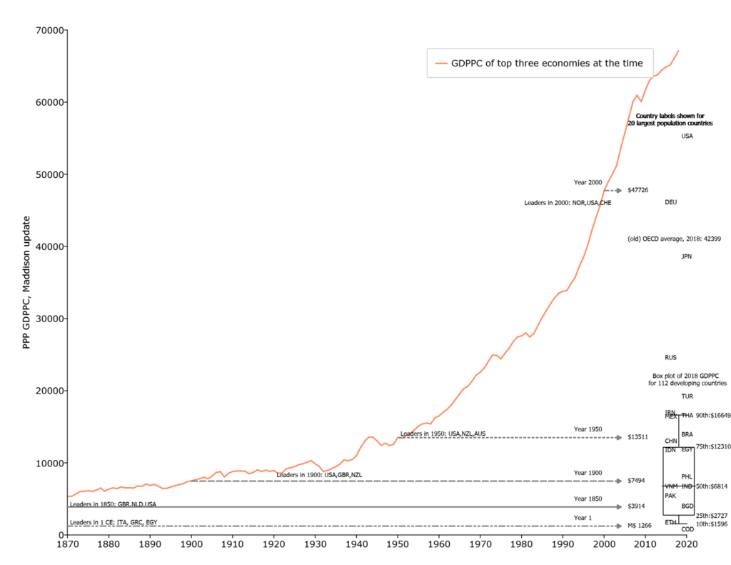
This somewhat unusual combination of a “time series” diagram and a “cross-section” diagram allows the visual comparison of (roughly) current GDPPC of developing countries to the level of GDPPC of the historically leading countries.
Three observations.
First, the typical poor country has a level of GDPPC that the leading countries had more than a century ago. The median developing country GDPPC is M$6814 (roughly the 2018 level of Vietnam and India) which is substantially below that of the leading countries in 1900.
Second, the poorest countries of the world (e.g. Ethiopia, Democratic Republic of Congo (COD), Niger) are at levels of GDPPC comparable—or lower—than those of Egypt during the Roman Empire 2000 years ago.
Third, three quarters of developing countries have a level of GDPPC lower than the leading countries in 1950, the 75th percentile (e.g. around China, Indonesia, Egypt) is M$12310. The nature of exponential growth is that the same growth rate produces larger and larger absolute increases so the leaders in the year 2000 were at M$47,00—which is M$33,000 ahead of where they were in 1950. Progress in absolute gains from 1 CE to 1900 was only about M$6200 so there has been five times from gain from 1950 to 2000 than from the time of Caesar to the Victorian era.
The main point of this graph is that it would be expected and natural for the currently high income countries to have very different priority of further economic growth than the currently poorer countries as their current level of GDPPC is so high relative to both their own history and other countries today. Three quick observations:
- There was little to no discussion in the now leading countries that economic growth was not desirable and needed in 1900 but rather that economic growth was not a high priority this seemed to have emerged gradually. The American politician Robert F Kennedy gave a very famous speech in which he attacked GDP as a goal in 1968. In 1968 GDPPC was already M$23,691, well above any currently developing country and 3.5 times higher than the median developing country in 2018.
- Even at the currently very high levels of GDPPC of M$40,000 the debate is whether growth of GDPPC should receive less weight or “not a priority” but no leading politician has proposed adopting a policy of zero economic growth.
- No leading politician in any advanced country is suggesting that it would be desirable if GDPPC fell—even a tiny bit.In the massive financial crisis of 2007-2009 personal consumption expenditures fell from US$33,001 in 2008 to US$32,194 in 2009 and this was considered a political catastrophe and every available effort was made to reverse that decline.
- Practically no one (or no one practical, which is often the same thing) is proposing reducing GDPP to the current levels of any of the developing poor countries. While New Zealand might not be enshrining GDPPC growth in its current priorities, neither is it suggesting a return to its 1950 level, where the now poor countries are.
Graph Two: Median (typical) household income explains essentially all poverty differences across countries (in levels and over long episodes)
There is a relatively large literature about the relationship between “economic growth”—taken as the growth of GDP per capita—and standard Foster, Greer, Thorbecke (1984) measures of poverty. What the World Bank reports as the poverty rate (or number of people in poverty) is “headcount” poverty (FGT(α=0) for a given poverty line using data on household income or consumption (depending on what is available, most very poor countries do not (cannot? ) measure income reliably). This includes a set of papers by David Dollar and Aart Kraay (with others) (Dollar et al., 2016; Dollar et al., 2015; Dollar & Kraay, 2002)—and a very recent paper by Bromberg (2022).
The relationship between the headcount poverty rate and GDPPC combine (at least) three empirical issues:
- How much of GDPPC is consumption expenditures
- Whether the consumption expenditures measure in national accounts accords well and/or tracks with measured consumption expenditures in household surveys (for instance, in India, there has been a very large and persistent difference in the growth rate of PCE in that national accounts and the growth of average consumption expenditures in the household surveys used to measure poverty rates leading to very different views on poverty rates (e.g. Bhalla, Bhasin, and Virmani 2022).
- National accounts PCE per person is a mean and hence changes in inequality at the upper end of the distribution can affect growth of the mean without changes in other measures of the central tendency of the distribution, like the median.
The graphs here use a different concept of “economic growth” which is the growth of the median of the distribution of consumption/income that the World Bank uses to compute poverty rates. So, rather that ask “how much of the variation in the poverty rate across countries and time is associated with variation in GDPPC across countries and time?” I ask, “How much of the variation in poverty rate across countries and over time is associated with variation in the level or growth over time of the consumption of the typical household (which is an alternative measure of the central tendency of the distribution)?
I use the raw data from the World Bank’s PovCalNet to create this graph.
- I do the graph for the three poverty lines the World Bank routinely reports (P$1.9 /day,, P$ 3.2/day and P$5.5/day) where all are in purchasing power parity unite (the adjustment of which can lead to changes in measured poverty ).
- In order to create relatively complete and timely reporting of poverty rates even though the raw household data collection is sporadic the World Bank “fills in” poverty rates. In my graph I only use the country/year poverty and median data that are near to the date of an actual survey.
- I use only those country/year data based on consumption data (not income data, which may or may not fully reflect the post tax and transfer distribution).
The first figure shows the connection between the level of the headcount poverty rate and the median for 189 country/year observations. In order to allow the association to be as flexible as possible I use a functional form for median consumption with powers from -2 to +5, the connection between poverty rates and median is analytically non-linear (Bromberg 2022). The figure I truncated at P$8,000 as above that level poverty is essentially zero for all poverty lines.
The second figure examines changes over time. With a highly non-linear functional form one cannot just run a “changes on changes” regression. Rather the graph calculates the predicted poverty rate at the beginning and end of the data for each country using the level estimates and then shows the association between the actual change in poverty rate and the change in the predicted poverty rate on the assumption of a stable non-linear relationship over time.
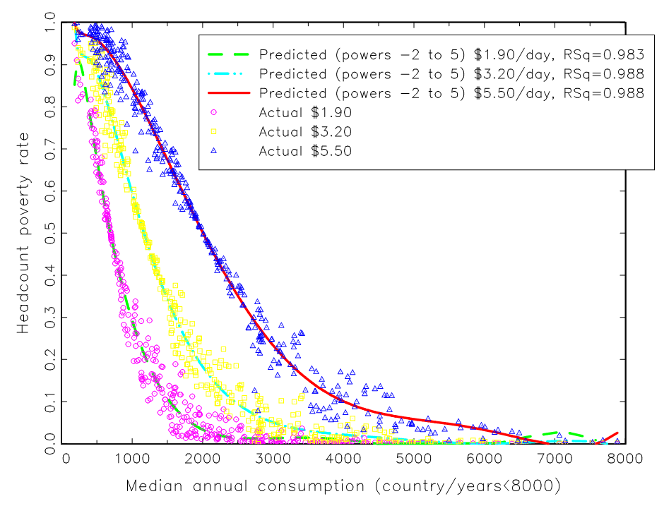
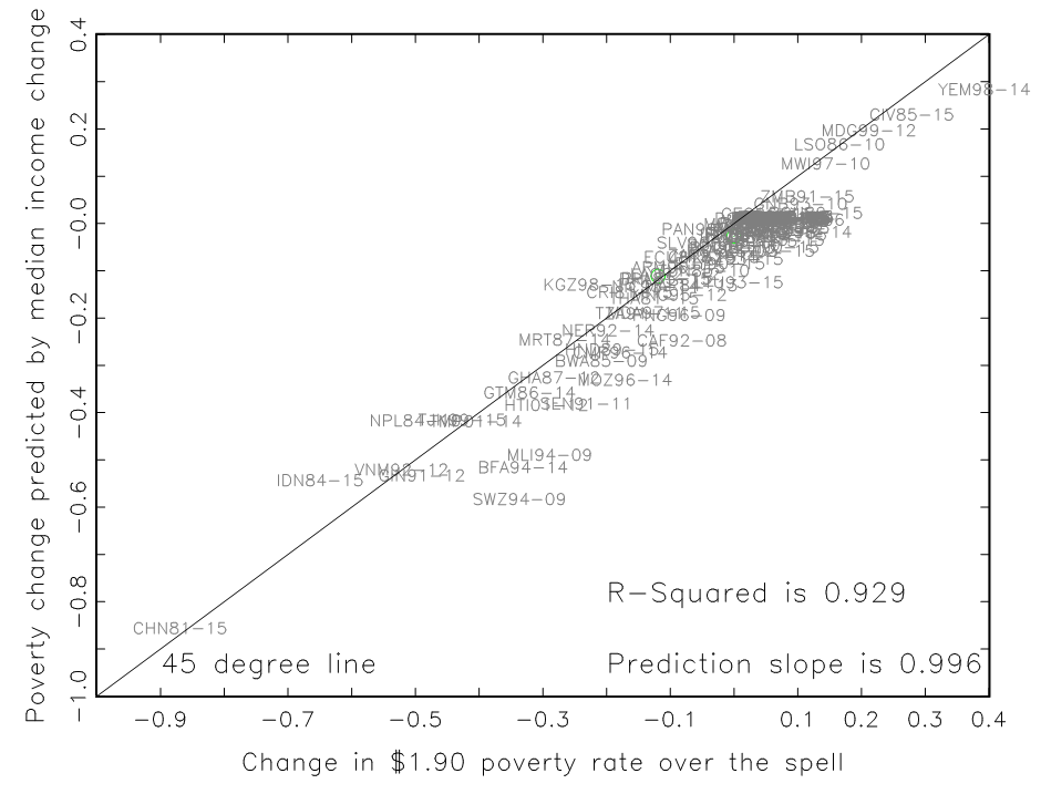
Source: Pritchett 2020, Figures 3 and 4.
The finding that emerges clearly is that essentially all of the variation across countries/over time in the reported World Bank headcount poverty rates is due to variations in the income of the typical (median) household in the country/year. An R-Squared of .988 is practically unheard of as measurement error in either the left hand or right hand side variables lowers the R2. (For instance, in Filmer and Pritchett 1999 we show that if one uses different years of the same data source, the Demographic and Health Survey (DHS) to measure child mortality of the same cohort of women recall error produces an upper bound on the R2 of the cohort child mortality rates of only .95.)
Some might object that this result is “baked in” as the estimated poverty rate is just the partial integral of up to the poverty line of the same distribution used to compute the median so the difference cannot be that big. But since I am using only consumption data the data is, in principle, a post tax and transfer measure so that any programs that raised the consumption of those below the poverty relative to the median would in fact cause a deviation of poverty from the pre-tax and transfer distribution of income.
The impact of targeting anti-poverty programs therefore should be reflected in this graph and hence the graph of levels suggests that at the very most 1.2 percent of the cross national variation in poverty rates could be due to the effects of programs that affected “the poor” without affecting the median.
This raises two points that help produce this very strong result.
First, in many cases the poverty line is above the median HH income and hence the poverty rate is higher than 50 percent. (one can see in the graph that the association gets very right when the headcount poverty rate is near .5 for each poverty line).
Of course, in poverty measures that reflect the “intensity” over poverty, such as the FGT(α=1) “poverty gap” or FGT(α=2) “squared gap” measures, could be affected by anti-poverty programs. But these are rarely reported or used (more on that below).
Second, the results suggest that the magnitude, efficiency, and efficacy of anti-poverty programs is a very, very small part of the level of change in poverty over long episodes. My argument is that, on reflection, this should strike us all engaged in development as quite “intuitive” on each aspect.
- The magnitude of targeted anti-poverty programs in poor countries is going to be limited by the ability to mobilize tax revenues (and poor countries consistently have lower tax/GDP ratios Burgess and Stern 1993, Besley and Persson 2013, Jensen (2019)) and by the many competing demands for those scarce fiscal resources (for external security and law and order, for infrastructure (roads, power, water, sanitation), for education, for health, for regulation, for administration, etc.).
- The fiscal efficiency of a targeted anti-poverty program can be measured as the ratio of the dollars in budget allocated that reach program the activities and benefiting targeted individuals. One well known fact is that generally measured “state capability” is lower in poorer countries so one can easily doubt that either (a) identifying the poor (which is administratively demanding even in a static sense, and static targeting is not very effective at reaching the poor as poverty status of households changes over time (Jalan and Ravallion 1998, Sumarto, Suryahadi and Pritchett 2000) and dynamic targeting is very demanding) and then (b) ensuring against leakage (of at least three types: (i) corruption to rent seeking government (political or administrative) offices, (ii) excess costs of administration, and (iii) mis-targeting of benefits) is going to be a strong suit of a poor country government.
- The efficacy can be measured as the magnitude of the (sustained?) gain to the household from the activities. It has been a major research agenda to investigate whether common anti-poverty activities like micro-credit or business training are actually effective. While some activities have been demonstrated to be effective in some (but not all) contexts when implemented by NGOs (e.g. “graduation” style programs Banerjee et al 2015), they are quite complex in design (and that complexity appears to be essential to success) and implementation by governments is by no means assured.
The figures just show that in the data available so far, if “economic growth” is taken to mean the growth of the central tendency (median) of the distribution of consumption has been a very strong empirically necessary and empirically sufficient for headcount poverty reduction.
This is not to say that governments (or NGOs or philanthropists) cannot reduce poverty through greater fiscal allocations, greater efficiency or greater efficacy nor that research (including using rigorous methods) might not contribute to that. But this is likely to be a very, very, small part of the overall dynamics of poverty.
One additional figure, that I will not count as one of the “five” is, in some sense, the micro, qualitative counterpart of the macro figure. In the major study Moving out of poverty (vol 2); Success from the Bottom Up a “ladder of life” community focus group was used to identify those in the village who had, in the last 10 years, moved out of poverty. These households, identified by their neighbors as having moved out of poverty. were then interviewed about their own narrative of how they moved out of poverty. A figure from this shows the distribution of the responses among the almost 4,000 interviewees. In their own narratives their undertaking a new initiative (either outside of agriculture (60.1%) or in agriculture (17.4%) or hard work (5.5%) or asset accumulation (4.7%) or increased community prosperity (1.6%) accounted for nearly all the moves out of poverty.
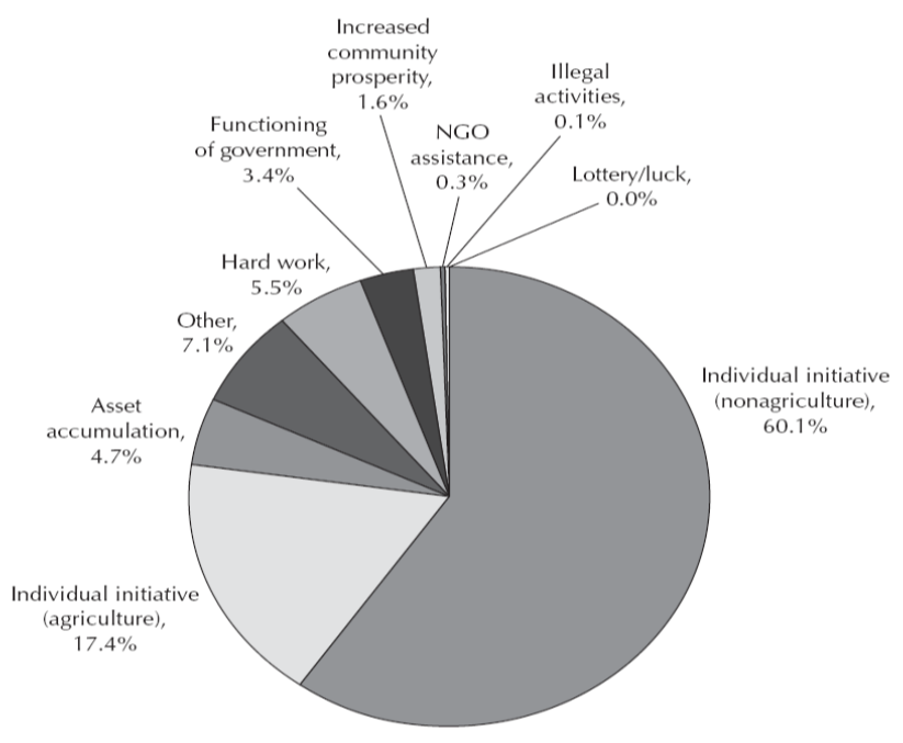
Source: Narayan, Pritchett and Kapoor (2009)
Graph 3: National Development Delivers
One of the elements of a push back (mostly in currently rich countries) against economic growth as an key policy objective is that it is not tightly connected to human wellbeing. For instance, an organization called the Social Progress Initiative has proposed the development efforts should be guided by non-economic measures of progress and have created for that purpose a Social Progress Index (SPI).
We dream of a world in which people come first. A world where families are safe, healthy and free. Economic development is important, but strong economies alone do not guarantee strong societies. If people lack the most basic human necessities, the building blocks to improve their quality of life, a healthy environment and the opportunity to reach their full potential, a society is failing no matter what the economic numbers say. The Social Progress Index is a new way to define the success of our societies. It is a comprehensive measure of real quality of life, independent of economic indicators.
The SPI is an aggregate of three components, each of which is itself has four elements:
Basic Human Needs is the average of (i) Nutrition and Basic Medical Care, (ii) Water and Sanitation, (iii) Shelter, and (iv) Personal Safety
Foundations of Wellbeing is the average of (i) Access to Knowledge, (ii) Access to Information and Communications, (ii) Health and Wellness, and (iv) Environmental Quality
Opportunity is the average of: (i) Personal Rights, (ii) Personal Freedom of Choice, (iii) Inclusiveness, and (iv) Access of Advanced Education.
My argument is that development efforts have routinely be predicated on the idea that “development” is a four-fold transformation of economy, administration capability, polity, and society at the country level and that, if successful, higher levels of national development will lead to higher levels of human well-being.
This leads to an empirical question. Suppose I regress the SPI across countries on three measures of national development: national development, state capability, and democracy (as a proxy for “polity”), how much of the variation in SPI will be captured by just these three measures of national development? Pritchett (2022) shows that the answer is that the R-squared of regressing SPI on these three elements of national development is .9 (since the R-squared is the square of the correlation coefficient this implies the correlation of actual SPI and a national development index constructed using the regression weights is .95).
I invented a graph to illustrate the connection between the SPI and the NDI (national development index, which is the regression weight index of the three elements of national development), which is an “envelop” graph because the envelop shape completely encloses all of the country experiences.
The lower bound of the envelop is the worst SPI is for any country with that level of NDI or higher. For instance, India (IND) has the lowest SPI of any country with its level of NDI or higher, there are countries with higher SPI at their level of NDI but only countries with lower NDI have lower SPI.
The upper bound of the envelop is the country with the highest SPI for any country with its level of NDI or lower. For instance, Nepal (NPL) has a high SPI with a low NDI. There are countries at higher SPI, but only those with higher NDI.
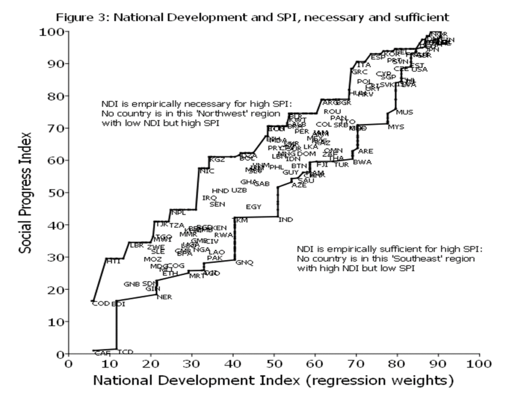
The attractive feature of an enveloping graph is that the white space is meaningful as it illustrates the combinations of SPI and NDI that have not happened. This illustrates how empirically necessary and empirically sufficient NDI is for achieving human wellbeing (as proxied by SPI).
NDI is strongly empirically necessary for high levels of human wellbeing. The empty “northwest” of the graph shows that no country has high SPI with low NDI. For instance, Argentina (ARG) has a level of SPI around 80 and is on the upper range of the envelope. Argentin’’s NDI is around 70 and no country has achieved a SPI above 80 with NDI below 70.
NDI is also strongly empirically sufficient for high levels of human wellbeing. The empty “southeast” of the graph shows that countries do not have high GDPPC, strong state capability and democracy and still have low levels of human wellbeing. Malaysia (MYS) for instance, does have SPI much lower than other countries at similar NDI (such as Spain or Korea) but its SPI is still higher than the SPI for any country with NDI of 60 or less.
Even with the measures of human wellbeing proposed by advocates who are working against the supposed current “over emphasis” on growth, national development delivers. It is just not the case that countries get to high levels of overall, omnibus, wellbeing without national development nor do countries achieve high levels of national development and not have high levels of human wellbeing.
Graph 4: Basics and GDPPC
The Social Progress Index is one possible aggregate index of human wellbeing, but one might legitimately be concerned about a narrower indicator of “the basics”—elements of human wellbeing that are prioritized by people with low incomes.
In Pritchett and Lewis (2022) we examine a wide variety of ways to construct a country level measure of the basics of human wellbeing that covers a variety of dimensions (health, education, water and sanitation, infrastructure and housing conditions, poverty, natural environment). We show that no matter how one builds an index of basics the relationship between BHWB and GDPPC is roughly like this figure, for which the indicator of “basics” is built from a set of 82 potential wellbeing indicators from the Legatum Prosperity Index, each of which is scaled to that the worst country is 1 and the highest country outcome is 100 (so this puts all indicators on a common scale but preserves cardinality of each indicator).
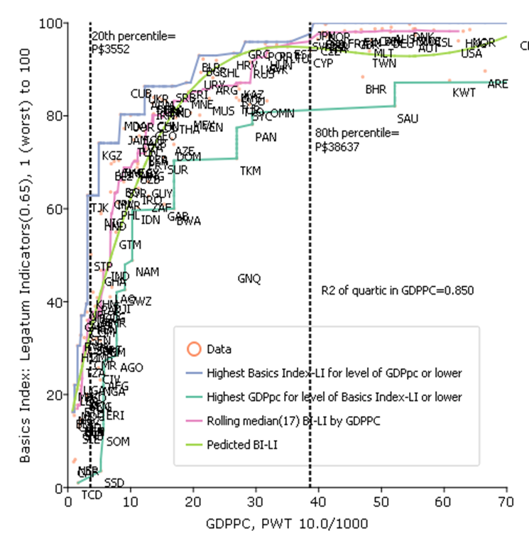
There are two important features of this graph.
One, the relationship is strongly non-linear and the BHWN rise very steeply with increases in GDPPC and then tapers off and then above a high level (say, the 80th percentile of countries at GDPPC of (roughly) P$40,000 it is essentially flat. (This non-linear relationship is shown both with an OLS regression with a quartic in GDPPC but also in a non-parametric, robust statistic of the rolling median).
Second, the relationship is “tight” in the sense that the association is very strong.
The same “envelopment” curve approach as in the previous grapth shows that not just national development but GDPPC alone is strongly sufficient for BHWB.
The one country not included in the envelopment is Equatorial Guinea (GNQ) which is the exception that proves the rule, in that GNQ has high GDPPC because of oil production but given than GNQ had a horrific government (since its independence from Spain in 1968 it has had two dictators (uncle and nephew) this high level of GDPPC has not translated into benefits for the population.
GDPPC is also “empirically necessary” for high levels of BHWB. Every country in the bottom 20 percent of GDPPC has very low levels of basics. At middling levels of GDPPC there is more variation, but it is still the case that no country with low GDPPC achieves high level of BHWB characteristic of all of the OECD countries. For instance Cuba is often cited as a country that achieves high levels of wellbeing at low levels of income, and indeed it does, but it is still substantially below the level of every OECD country.
The very important implication of this graph is that “preferences don’t determine priorities.” It would be perfectly natural for a country at the median level of GDPPC to be highly focused on rapid and sustained economic growth in order to provide the material basis for achieving high levels of the basics of human wellbeing.
And, by the same token, countries at very high levels of GDPPC, like say, New Zealand, might decide that there are other higher priorities for wellbeing that economic growth and that they already have the high levels of economic productivity and material conditions to solve their problems.
But, what would be a massive mistake would be for people in New Zealand (or any other high income country) to conclude that since their priority was not on economic growth that other countries, in radically different material conditions and radically different levels of the basics, should not prioritize economic growth.
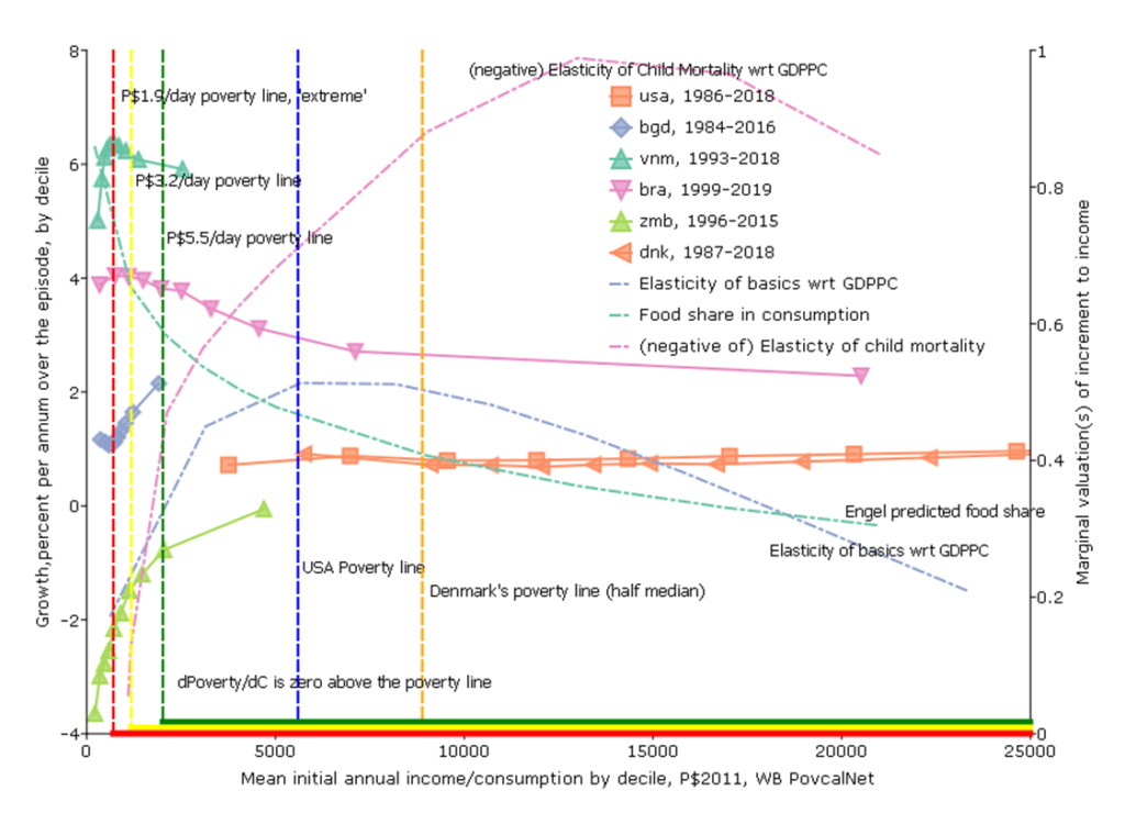
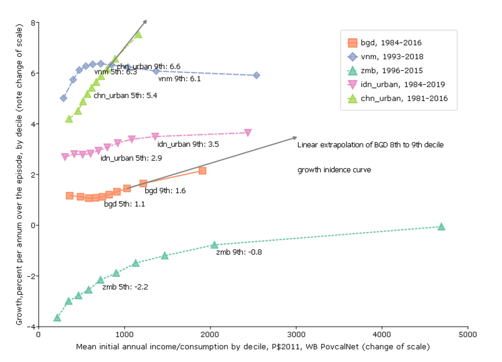
Graph 5: Growth Incidence (with five variants)
So far I have not used any of the very popular adjectival modifiers often appended to growth that characterize both the level of growth and its distribution–like “inclusive” or “pro-poor.” The last graph (which will need five variants just to convey the richness of what it can convey) addresses simultaneously: (i) the pace of growth, (ii) the level of income from which growth begins, (iii) the “growth incidence” which is the pace of growth for each of the deciles of income/consumption and (iv) the normative valuation of incremental growth across levels of income.
For this figure I again use the World Bank PovCalNet data and I use the longest possible data span (with survey based estimates, not extrapolated) for each country. I am not showing all possible countries, just countries selected to illustrate analytic features.
The horizontal axis is the level of income/consumption at the beginning of the episode for each country.
Then, for each country I show (left vertical axis) a standard “growth incidence” curve which is the percentage rate of growth of income/consumption (again, nearly always consumption for poor countries, nearly always income for middle income and rich countries) for each decile.
On the right axis I show various indicators that are relevant to the normative valuation of the growth of income at any given level of income. In the “basic” figure I show (i) the Engel curve that shows the predicted level of share of food in total consumption at each level of income and (ii) from the regressions of basics on GDPPC shown in the graph above (Pritchett and Lewis 2022) I show the elasticity of BHWB wrt GDPPC at each level.
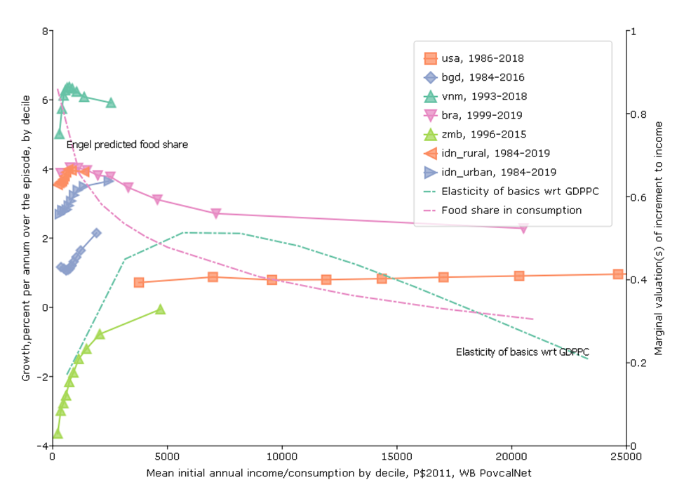
Fifth Figure, Variant 1: The rich of the poor are poorer than the poor of the rich
One common justification for reducing the priority to economic growth is that it just benefits “the rich” and “the rich get richer and the poor get poorer.”
This can be misleading and confusing as often people saying things like this are not clear on whether they are using the word “the rich” in a consistent way. Often people characterize “the rich” in relative terms to their own country and not in a consistent way comparing people across countries.
This confusion leads people who are “progressive” easily end up in a situation in which they are very much in favor of raising the income/consumption of one group (“the poor” of rich countries) but seem reluctant to support increases in income/consumption of people who are, in absolute terms, much poorer.
For instance, the average income (and this is income, not consumption) of the lowest decile in Denmark in 1987 was P$5753. Among the global policy crowd European countries like Denmark are often roundly praised for the variety of programs that raise the consumption of “the poor” in Denmark so that their post-tax and transfer consumption can be much higher than their pre-tax and transfer income.
But the average income of the richest decile in Bangladesh in 1984 was P$1908. And since these “purchasing power parity” comparisons they are adjusted for the fact it is cheaper to live in poor countries so this is at least meant to compare people’s purchasing power directly in absolute terms. So “the rich” of a poor country like Bangladesh are a factor of 3 poorer that the income of the poor of a rich country.
Many people are skeptical about this fact and believe that the PPP really compare standards of living (often with no good reason). But Pritchett and Spivack (2013) use data on the food share in consumption—which therefore involve no use of exchange rate comparisons of any kind—and the Engel curve to show that the differences in food share between “the rich of the poor” and the “poor of the rich” is consistent with the factor multiple differences in real consumption that PPP data show.
This “rich of the poorer are poorer than poor of the rich” is (of course) not true of upper-middle income countries with high inequality, like Brazil. The average income (and it is income, not consumption) of the top decile in Brazil is P$20, 515, which is will above the median of the USA or Denmark.
And one can also distinguish between the rich and the global hyper-rich like billionaires, which is an entirely different issue (as we discuss below).
Fifth Figure, Variant 2: Low bar poverty lines are economically indefensible (and morally obscene)
A second major objection to economic growth is to argue that the marginal normative valuation of additional consumption declines very rapidly to a very low level and hence growth may not be that important for a normative social objective function.
This normative under-valuation of income gains reaches truly surreal levels with “low bar” global poverty lines. The main feature that distinguishes the mainstream FGT(α) poverty measures from any other social welfare function (like, say, an Atkinson-inequality adjusted income measure) is not that “poverty puts more weight on the wellbeing of poorer HHs”—as all inequality averse measures do that—but that poverty measures put exactly zero weight on income above the chosen poverty line. For example, with the “dollar a day” poverty line (now P$1.9/day with inflation) if someone’s income increases from P$1.95 to P$2.00 this would have exactly zero impact on any standard (FGT) poverty measure using the P$1.90 poverty line.
This means that a standard normative welfare function and poverty as an objective only (roughly) coincide if one is willing to accept that the marginal valuation of consumption gains above the poverty line being used is (reasonably) well approximated by zero.
That view for the standard poverty lines used by the World Bank is, I would argue, complete madness, for four reasons.
First, there is no line. The opening of Alfred Marshall’s Principles of Economics was Natura non facit saltus (“nature does not jump” in Latin). The classification of something “above” or “below” some more or less arbitrarily drawn line through the income/consumption should not create the issue that things are qualitatively different below and above that line. If one examines wellbeing outcomes—health, education, malnutrition, access to water, etc.—there is often a reasonably strong connection between those “goods” and HH income. But I have never, ever, seen any empirically demonstrated discrete jump or “phase transition” around a specified line (or even a close approximation to it).
Second, even if there were a line above which it would be a reasonable approximation to treat consumption gains as having ‘near’ zero value it is nowhere near the World Bank poverty lines.
While there is no way to say what “marginal utility of income” is and how exactly it evolves with income the figure shows three pieces of empirical evidence.
One, I estimate an Engel curve relating food share in consumption to PPP consumption expenditures (and, as Pritchett and Spivack (2013) show the actual Engel curve parameters are remarkably similar over time and samples and method so the details don’t really matter). At the P$1.9 per day poverty line the predicted food share is around 80 percent. The marginal propensity to spend is less than the average (as it is declining) but there is no way one can argue that additional income has “about” zero impact on wellbeing when HHs are still spending 50 percent or more of the incremental income on food.
Two, the graph above showed that the slope of the relationship between basics and GDPPC was highly non-linear and that it was very steep at low levels of income. However, the more common measure of responsiveness is the elasticity (which is the percentage change of basics over the percentage change in GDPPC) and when one computes the elasticity of BHWB wrt to GDPPC it emerges that this slope actually starts out low and then increases as GDPPC increases up to a point and then starts to decline to much lower levels at high levels of GDPPC.
The striking thing is that at the highest of the WB reported poverty lines, of P$5.5/day, which is consumption per year of only P$5.5/day*365days/year=P$2007/year (and then adjusting the elasticity curve so that elasticity is predicted consumption not GDPPC) the elasticity or responsiveness of basics to increases is not only “near zero” and not only is it not decreasing, but rather it is still rapidly increasing. So countries with growth at the levels of the poverty lines are seeing basics of wellbeing (health, education, water and sanitation, etc.) improve at an increasing rate. To assert that zero is good approximation to the benefits of income about that level is well approximated by zero (as poverty as an objective demands) is surreal.
Three, I ran a regression of the standard World Bank Under Five Child Mortality data on a flexible functional form in GDPPC in part to illustrate that the shape of the elasticity is not an artefact of scaling or building an index. The same feature about the elasticity emerges as the responsiveness (elasticity) of child mortality to increases in GDPPC first increases (up to a quite high level) and then decreases (but is still very high even at the US 80th percentile). Again, I just don’t see how one can adopt “poverty” as the “objective” of development at such low poverty lines and then hence discount how much improvements in GDPPC contribute to improving wellbeing.
I am not making any of: (i) “materialist” case that money/income/consumption is the only goal (all of my arguments bring in other dimensions of human wellbeing, like child mortality or the natural environment), (ii) the case against declining marginal utility of income, (iii) the case that, at some level of GDPPC the attention should shift from prioritizing growth to other objectives.
But I am making the case that for a global poverty line something much more like Denmark’s poverty line of around P$25/day makes much more sense than a poverty line at less than 1/10th that value.
I am increasingly of the view that the implicit acceptance (or at least complicit toleration) of the “low bar” poverty lines that implied zero valuation of income gains above a ridiculously low threshold is the root of all evil in development. And I don’t mean “evil” in some vague metaphorical sense, I think the “golden rule” implies should only accept conditions for others we would accept for ourselves and no person advocating a “dollar a day” poverty line would ever accept that their own personal valuation of income gains above that threshold was zero. Low-bar lines do not pass a simple ethical test (and the philosopher Derek Parfit (2011) argues that something very much like the Golden Rule emerges from a variety of different ethical approaches).
Fifth Figure, Variant 3: Would you rather have a purple unicorn or a brown horse?
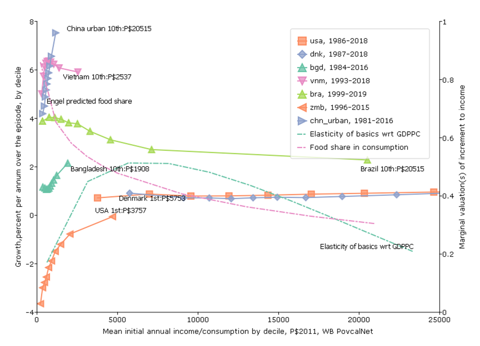
The third variant of the graph is to examine that growth incidence curves themselves considering both their slope/shape and their location. A key question is that if we have concern mainly for the growth of the lowest deciles is that primarily driven or determined by whether growth is “inclusive” or not (the shape/slope) of the growth incidence curve or by the average pace of growth for the economy at large (say, the average growth or growth of the median)?
For pretty much overall normative evaluation one (you, me) would rather have more rather than less “inclusive” growth (any sort of declining marginal utility gives that result).
But there is also the question would one (where “one” is you or me)—even if your only objective was growth of the poor rather have “inclusive slow growth” versus “pro-rich fast growth”?
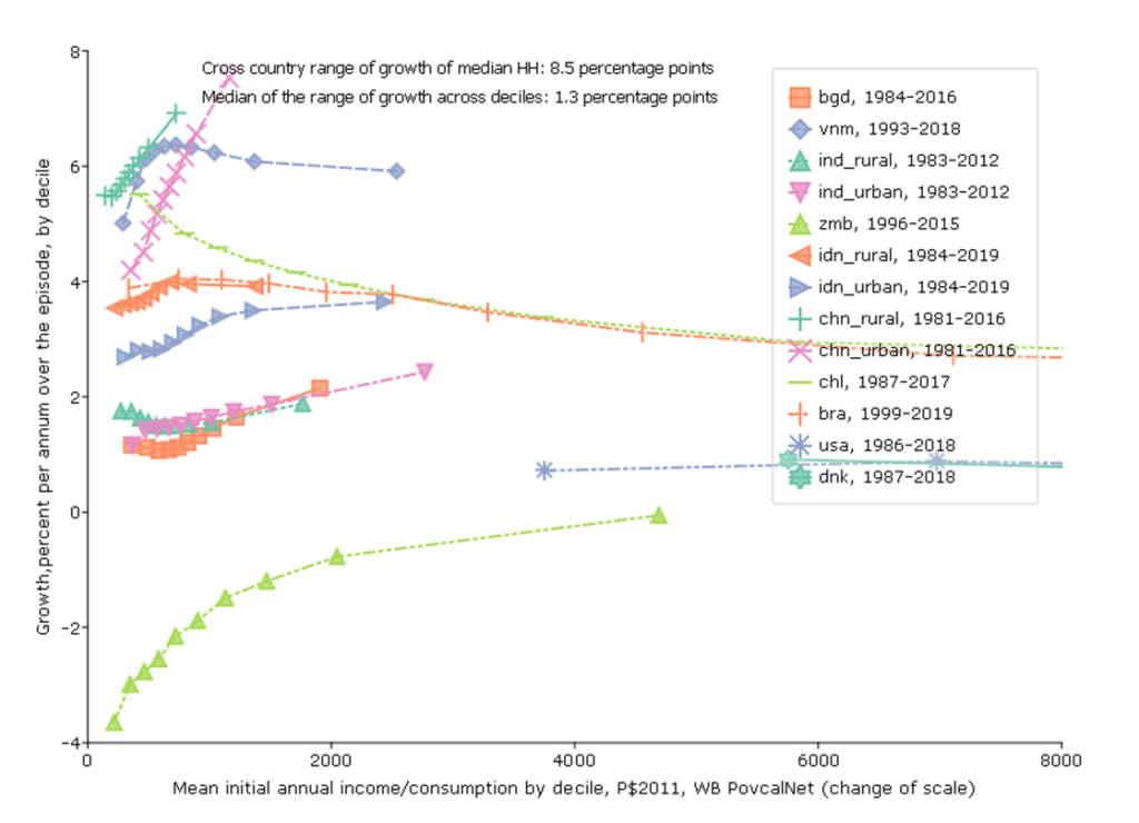
For instance, this data suggests that over the period 1984-2016 the consumption of the poorest decile in Bangladesh grew at 1.1 ppa and the consumption of the rich grew at 2.1 ppa, a difference between rich and poor of only 1 ppa so, while growth was not “pro-poor”, the growth incidence curve was not very steep.
In contrast, growth of the poorest in urban China 1981 to 2018 was 4.2 ppa but the growth of the richest decile was 7.5 percent, higher by 3.2 ppa. This was “pro-rich” growth but but in absolute terms, the consumption of the lowest decile grew massively.
The consumption of the lowest decile went from P$360 to P$525 in Bangladesh 1984-2016, while over a much period of 1981 to 2016 the consumption of the lowest decile in urban China went from P$353 to P$1489—more than quadrupling.
This graph doesn’t “prove” the point or even fully illustrate it, but empirical analysis shows that the correlation between the growth of the poorest (1st decile) and the average growth in the country is very high (Dollar and Kraay 2002) and hence even though poverty rates are responsive to changes in inequality it is still the case that most of the variation in poverty reduction is due to differences in country average growth rates (Bromberg 2022) . This itself is just a consequence of the fact that (a) the cross-national and time series variation in growth rates is very high and (b) the cross-national and time series differences in measures of inequality (like the Gini coefficient) are very stable.
This point is important as a great deal of discussion in development circles is about the adjectives that modify “growth”—the goal is never stated as “rapid, sustained, growth” but as “inclusive sustainable growth.”
One might prefer a purple unicorn to a green unicorn but their ontological status is the same and neither can pull your cart as well as a brown horse.
Fifth Figure, Variant 4: There are episodes like “Equatorial Guinea”—but they are very rare—income growth and wealth growth are not the same dynamic
There have been two phenomena, mainly in the USA, that have sucked up the air in the economic growth room.
One, is that the growth incidence curve in the USA has been highly tilted with the top percentiles capturing a large fraction of the benefits of growth.
Two, Thomas Piketty (and a few others) have been remarkably successful in shifting attention from the distribution of flows (income, consumption) to stocks (wealth) and, while doing so ignoring the single most important asset for most people, huma capital, in favor of financial wealth. This has been associated with attention to the rise in the number of the globally hyper-rich (e.g. numbers of billionaires), which is again about a stock of financial wealth, not the flow of income/consumption.
This has supported a push-back against economic growth (without adjectives) as a goal with the notion that the “hyper-rich” are capturing disproportionately large parts of the economic gains. Of course starting from any given level of income inequality even if inequality is unchanged the rich already control a larger share of income and hence they will, even at “neutral” growth incidence in percent rate of growth capture the same share of the gains as of the levels. For instance, in the data in the figures the top decile in Bangladesh had 22 percent of the consumption in 1984 and hence even if the income distribution did not get more unequal they would have had 22 percent of the gains (to keep their share constant).
We cannot isolate the upper deciles precisely with the existing data by deciles, but we can do two calculations to show that the “hyper-rich” are not capturing all (or nearly all or even a large share) of the gains.
We take advantage of the fact that if the far right tail is included at all, it is in the average of the top decile—but does not affect at all the average of the deciles below. I show the average rate of growth of the average income 9th decile, which is truncated both below and above. This growth is robustly quite high. Two points.
First, just to illustrate why this calculation is relevant. Imagine there was an economy of 100 people and their initial income was log-normally distributed and then income stayed the same for 999 of them and only the income of the top person doubled. Then there would be substantial growth in the average income even though only one person’s income changed. But if we did the percent change in income by decile growth would be zero for all deciles but the top, so the growth incidence curve would be a flat line at zero and then a rotated “L” shape with only the top decile (where the top individuals are) having positive growth.
Second, that said, I am not denying that there might be concentration of wealth and power in very few hands, but only that this wealth dynamic is not what is driving the overall growth results.
References
Bolt, J., & van Zanden, J. L. (2020). Maddison style estimates of the evolution of the world economy. A new 2020 update. Maddison-Project Working Paper, WP-15. https://www.rug.nl/ggdc/historicaldevelopment/maddison/publications/wp15.pdf
Dollar, D., Kleineberg, T., & Kraay, A. (2016). Growth still is good for the poor. European Economic Review, 81(C), 68-85.
Dollar, D., Kleineberg, T., Kraay, A., & Guriev, S. (2015). Growth, inequality and social welfare. Economic Poliy, 30(82), 335-377.
Dollar, D., & Kraay, A. (2002). Growth Is Good for the Poor. Journal of Economic Growth, 7(3), 195-225. http://www.jstor.org/stable/40216063
Filmer, D., & Pritchett, L. (1999). The impact of public spending on health: does money matter? Social Science & Medicine, 49(10), 1309-1323. https://doi.org/https://doi.org/10.1016/S0277-9536(99)00150-1
Foster, J., Greer, J., & Thorbecke, E. (1984). A Class of Decomposable Poverty Measures. Econometrica, 52(3), 761-766. https://doi.org/www.jstor.org/stable/1913475
Pritchett, L. (2022). National development delivers: And how! And how? Economic Modelling, 107, 105717. https://doi.org/https://doi.org/10.1016/j.econmod.2021.105717
Pritchett, L., & Spivack, M. (2013). Estimating Income/Expenditure Differences Across Populations: New Fun with Old Engel’s Law. Center for Global Development Working Paper, 339. https://doi.org/http://dx.doi.org/10.2139/ssrn.2364649